

Home
Legal appointments platform
Designing a high-stakes workflow platform for a UK professional appointments body
I joined the UI phase of a B2B workflow application for a government-adjacent legal appointments body, translating wireframe decisions into a production-ready UI, pushing back on key interface choices backed by research, and building a token-based design system engineered for accessibility and long-term expansion.
Creative & Product Strategy
UI Design
Design System
Web Accessibility
Engineer Handover
B2B Acumen
Token-based design system ready to support additional themes and product expansion

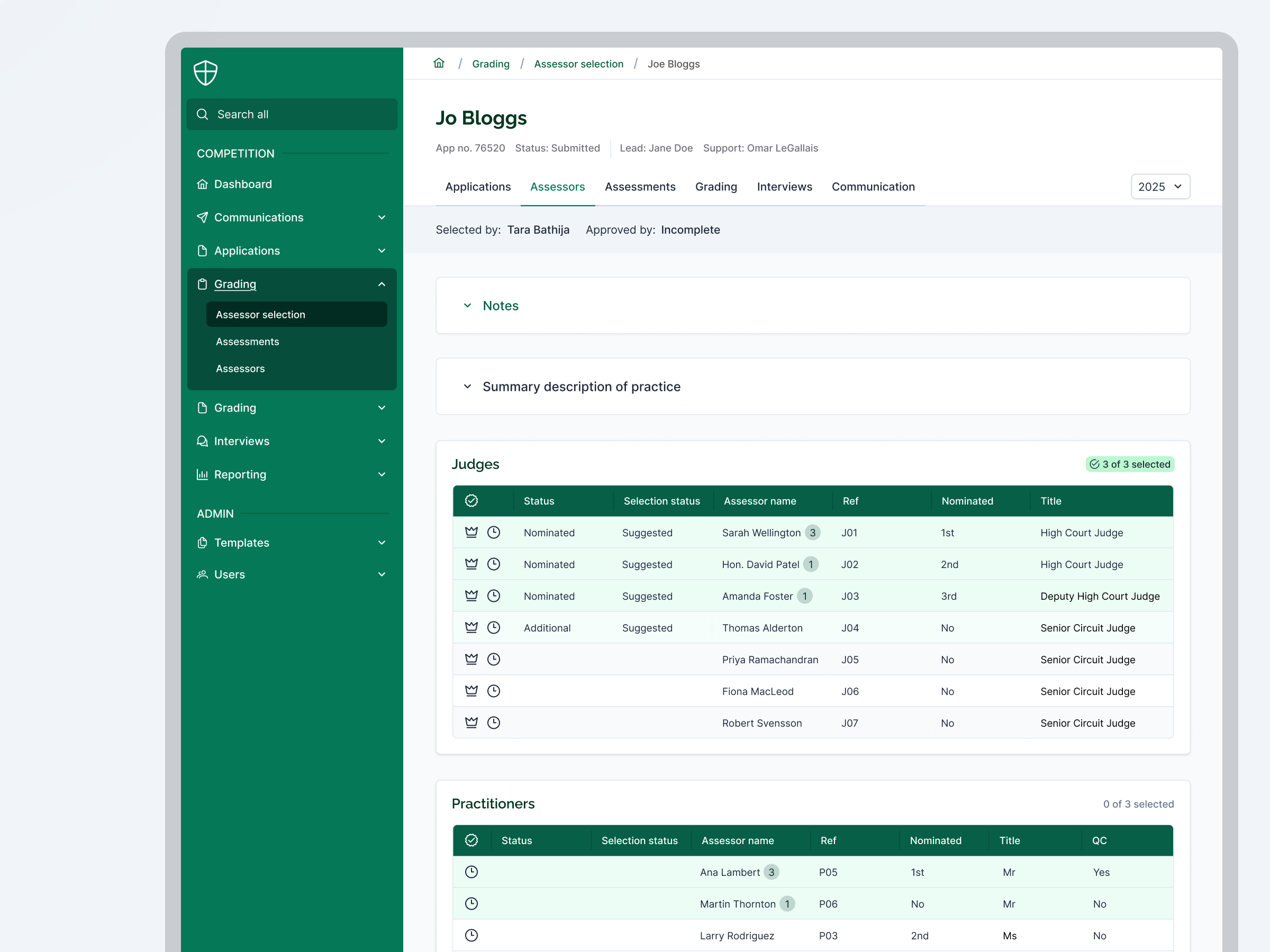
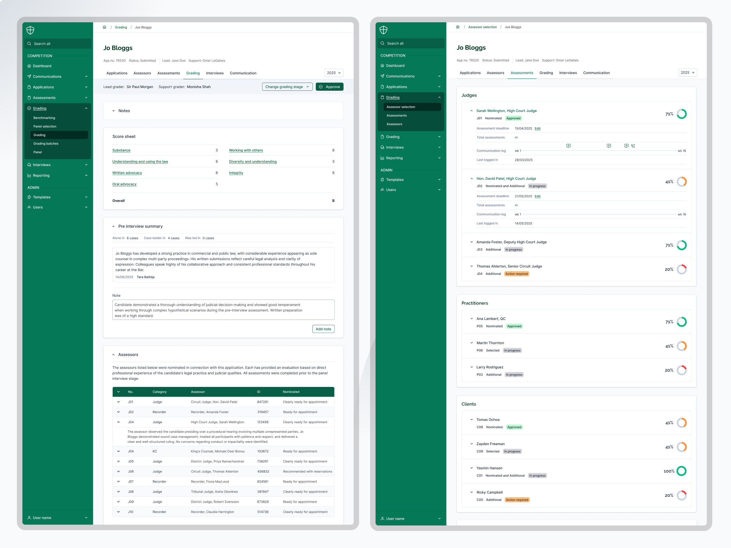
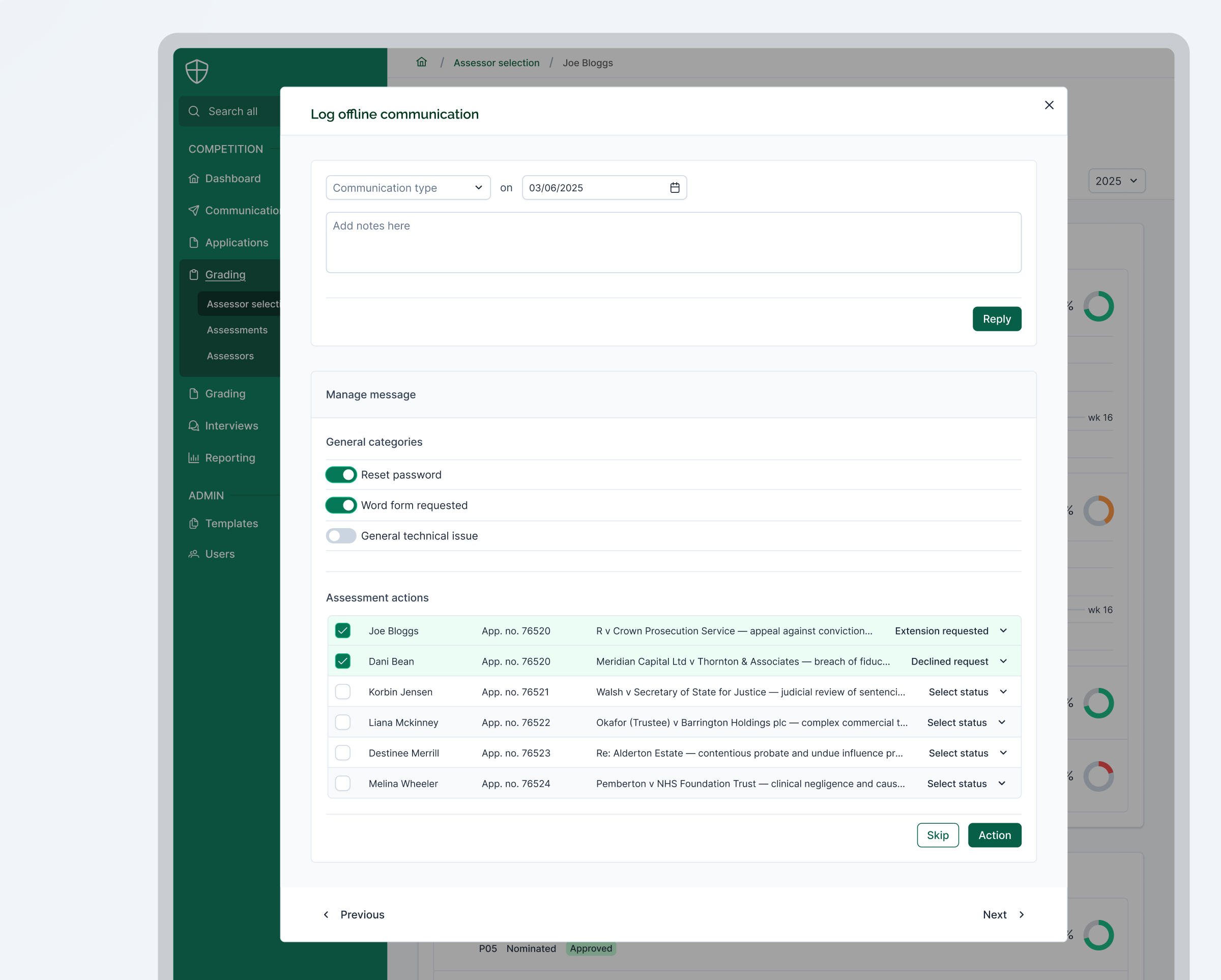
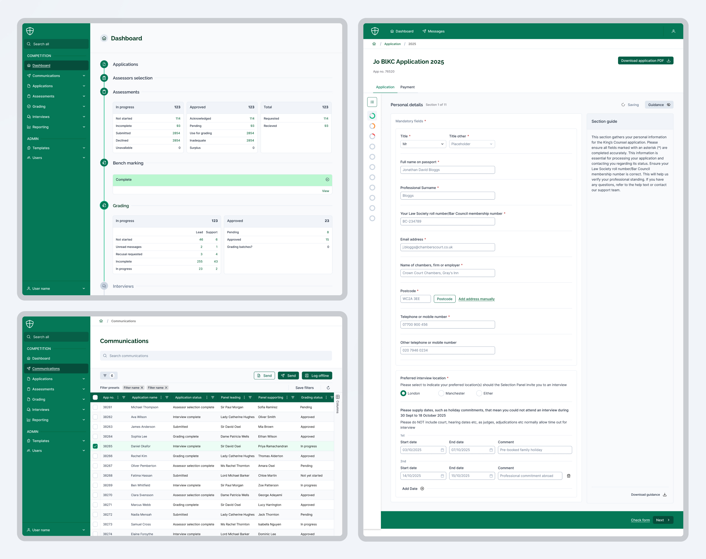
High-density data, high-stakes decisions
The platform handles a complex, multi-staged process — assessor selection, competency grading, interviews, and reporting — across a hierarchy of judges, practitioners, and administrators. Getting the interface wrong had real consequences: assessors needed to navigate dense data quickly and without ambiguity.
The constraint
No direct client access throughout the project. All design decisions were mediated through the PM and a close working relationship with the other designer — requiring clear rationale and strong documentation at every stage.
Budget reality
A tight budget meant no full prototype phase. The response was to invest more heavily in annotation, component documentation, and structured engineer handover — compensating for the absence of interactive prototypes with precision elsewhere.
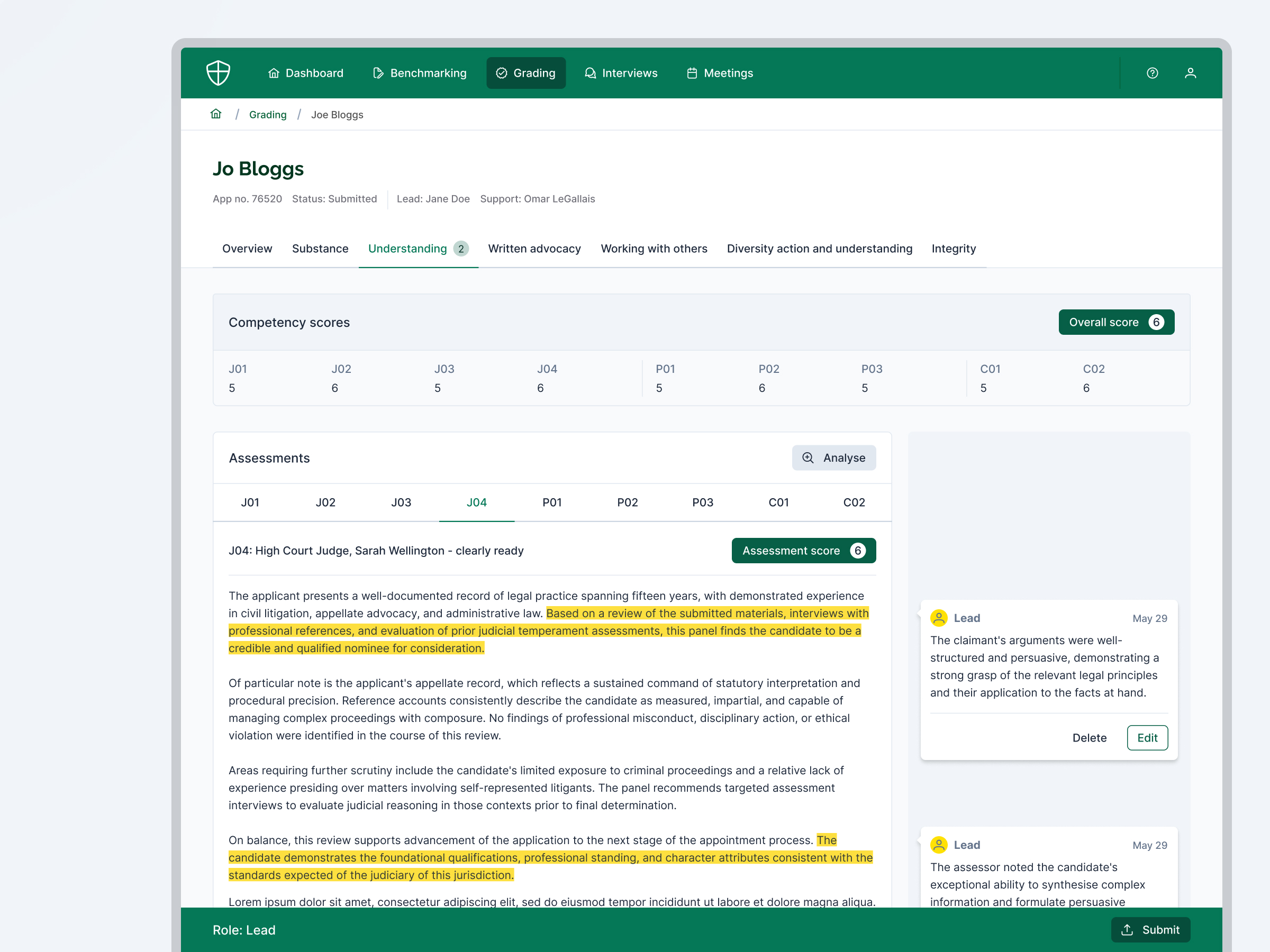
Shaping the product through research and pushback
The strongest contribution I made in the UI phase was challenging the proposed interface for competency score commenting. Rather than flagging a subjective concern, I did quick market research, benchmarked comparable tools, and brought the findings back to the team. The PM presented this to the client. The interface was changed.
The approach
Evidence-backed pushback rather than opinion — making it easy for the PM to present a clear recommendation to the client rather than an internal disagreement.
The outcome
The competency commenting interface was redesigned in the UI phase — a late-stage product change driven by design input, not client request.
Results
Delivered on time and on budget — with a design system positioned to support the platform's next phase without structural rework.
Client colour palette brought to WCAG AA compliance systematically through token reconfiguration.
Competency commenting interface changed at UI stage following research-backed pushback — a late product decision influenced directly by design input.
Token-based design system ready to support additional themes and product expansion — groundwork laid for an early-stage product's long-term growth.
Spending more hours than the budget required on the token system was a conscious decision — not scope creep. Early-stage products need the right foundations, whether the client can see them or not.
Created at Totally.tech
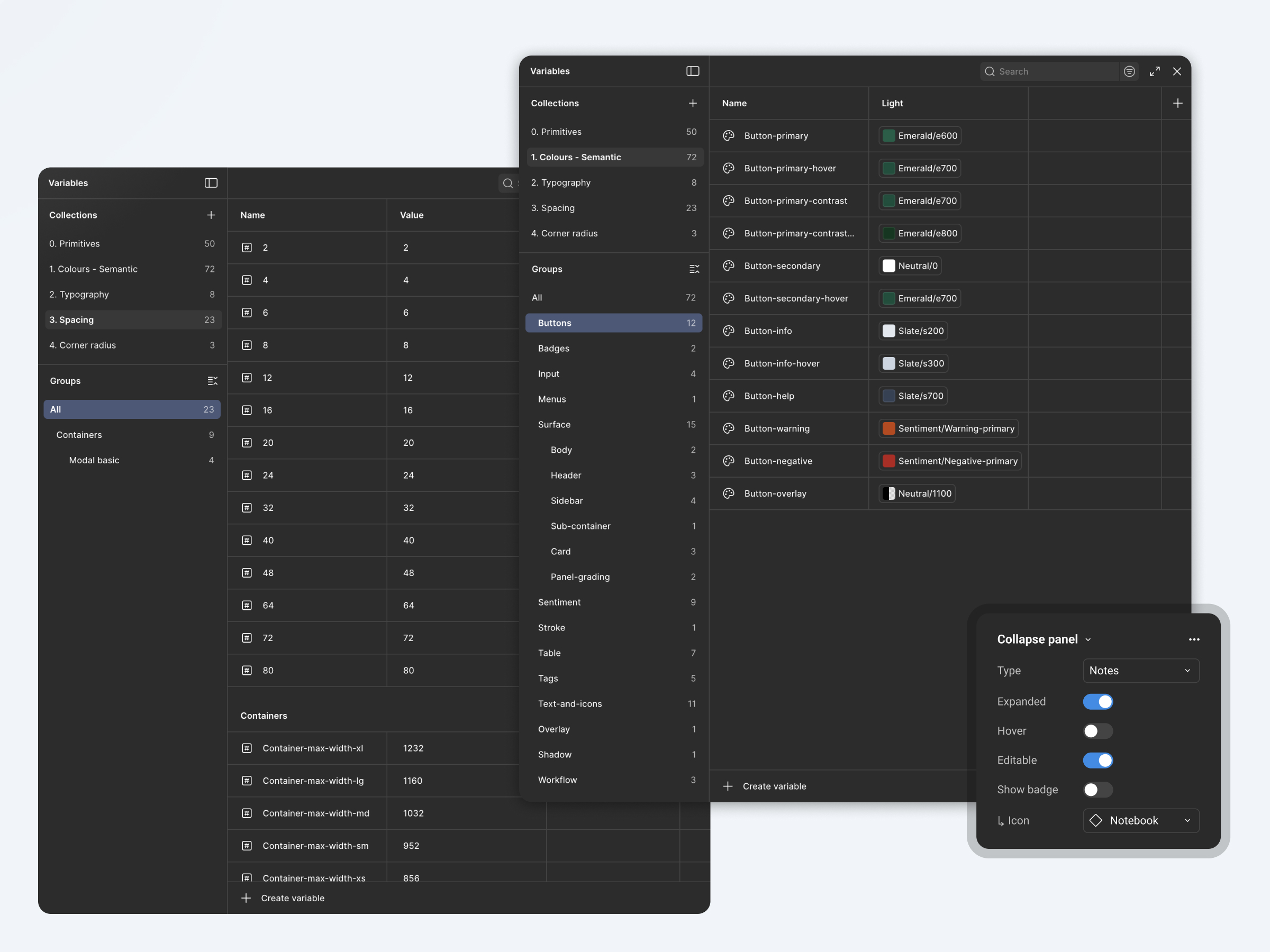
A design system built to last, not just to ship
The design system was adapted and expanded from Untitled UI — restructured for a data-heavy B2B workflow tool with WCAG AA compliance and future scalability built in. This is an early-stage product, and the groundwork needed to be right even if the client didn't immediately see the value in it.
Accessibility
The client's brand colours didn't meet WCAG AA standards for digital use. I adjusted the palette, reconfigured the semantic colour tokens, and relabelled the specific components affected — a systematic fix, not a patch.
Token architecture
Built with a primitive and semantic token layer separation, meaning additional themes and product expansions can be supported without reworking the system. This took more hours than the budget strictly allowed — a deliberate investment in the engineering team's future velocity.
Engineer handover
Led a structured handover with regular check-ins, component annotations, and documentation explaining the behaviour and intent behind each element — bridging the gap left by the absence of a prototype phase.


Mockneybynature.design
Home
Legal appointments platform
Designing a high-stakes workflow platform for a UK professional appointments body
I joined the UI phase of a B2B workflow application for a government-adjacent legal appointments body, translating wireframe decisions into a production-ready UI, pushing back on key interface choices backed by research, and building a token-based design system engineered for accessibility and long-term expansion.
Creative & Product Strategy
UI Design
Design System
Web Accessibility
Engineer Handover
B2B Acumen
Token-based design system ready to support additional themes and product expansion

High-density data, high-stakes decisions
The platform handles a complex, multi-staged process — assessor selection, competency grading, interviews, and reporting — across a hierarchy of judges, practitioners, and administrators. Getting the interface wrong had real consequences: assessors needed to navigate dense data quickly and without ambiguity.
The constraint
No direct client access throughout the project. All design decisions were mediated through the PM and a close working relationship with the other designer — requiring clear rationale and strong documentation at every stage.
Budget reality
A tight budget meant no full prototype phase. The response was to invest more heavily in annotation, component documentation, and structured engineer handover — compensating for the absence of interactive prototypes with precision elsewhere.
Shaping the product through research and pushback
The strongest contribution I made in the UI phase was challenging the proposed interface for competency score commenting. Rather than flagging a subjective concern, I did quick market research, benchmarked comparable tools, and brought the findings back to the team. The PM presented this to the client. The interface was changed.
The approach
Evidence-backed pushback rather than opinion — making it easy for the PM to present a clear recommendation to the client rather than an internal disagreement.
The outcome
The competency commenting interface was redesigned in the UI phase — a late-stage product change driven by design input, not client request.
A design system built to last, not just to ship
The design system was adapted and expanded from Untitled UI — restructured for a data-heavy B2B workflow tool with WCAG AA compliance and future scalability built in. This is an early-stage product, and the groundwork needed to be right even if the client didn't immediately see the value in it.
Accessibility
The client's brand colours didn't meet WCAG AA standards for digital use. I adjusted the palette, reconfigured the semantic colour tokens, and relabelled the specific components affected — a systematic fix, not a patch.
Token architecture
Built with a primitive and semantic token layer separation, meaning additional themes and product expansions can be supported without reworking the system. This took more hours than the budget strictly allowed — a deliberate investment in the engineering team's future velocity.
Engineer handover
Led a structured handover with regular check-ins, component annotations, and documentation explaining the behaviour and intent behind each element — bridging the gap left by the absence of a prototype phase.
Results
Delivered on time and on budget — with a design system positioned to support the platform's next phase without structural rework.
Client colour palette brought to WCAG AA compliance systematically through token reconfiguration.
Competency commenting interface changed at UI stage following research-backed pushback — a late product decision influenced directly by design input.
Token-based design system ready to support additional themes and product expansion — groundwork laid for an early-stage product's long-term growth.
Spending more hours than the budget required on the token system was a conscious decision — not scope creep. Early-stage products need the right foundations, whether the client can see them or not.
Created at Totally.tech
Next project
LLM Research Tool
Digital transformation for a sports leader
Enterprise SaaS, confidential client
Creative & Product Strategy
User Research
Prototyping
Design System
Web Accessibility
B2C Acumen
Mockneybynature.design


Home
Legal appointments platform
Designing a high-stakes workflow platform for a UK professional appointments body
I joined the UI phase of a B2B workflow application for a government-adjacent legal appointments body, translating wireframe decisions into a production-ready UI, pushing back on key interface choices backed by research, and building a token-based design system engineered for accessibility and long-term expansion.
Creative & Product Strategy
UI Design
Design System
Web Accessibility
Engineer Handover
B2B Acumen
Token-based design system ready to support additional themes and product expansion

High-density data, high-stakes decisions
The platform handles a complex, multi-staged process — assessor selection, competency grading, interviews, and reporting — across a hierarchy of judges, practitioners, and administrators. Getting the interface wrong had real consequences: assessors needed to navigate dense data quickly and without ambiguity.
The constraint
No direct client access throughout the project. All design decisions were mediated through the PM and a close working relationship with the other designer — requiring clear rationale and strong documentation at every stage.
Budget reality
A tight budget meant no full prototype phase. The response was to invest more heavily in annotation, component documentation, and structured engineer handover — compensating for the absence of interactive prototypes with precision elsewhere.
Shaping the product through research and pushback
The strongest contribution I made in the UI phase was challenging the proposed interface for competency score commenting. Rather than flagging a subjective concern, I did quick market research, benchmarked comparable tools, and brought the findings back to the team. The PM presented this to the client. The interface was changed.
The approach
Evidence-backed pushback rather than opinion — making it easy for the PM to present a clear recommendation to the client rather than an internal disagreement.
The outcome
The competency commenting interface was redesigned in the UI phase — a late-stage product change driven by design input, not client request.
A design system built to last, not just to ship
The design system was adapted and expanded from Untitled UI — restructured for a data-heavy B2B workflow tool with WCAG AA compliance and future scalability built in. This is an early-stage product, and the groundwork needed to be right even if the client didn't immediately see the value in it.
Accessibility
The client's brand colours didn't meet WCAG AA standards for digital use. I adjusted the palette, reconfigured the semantic colour tokens, and relabelled the specific components affected — a systematic fix, not a patch.
Token architecture
Built with a primitive and semantic token layer separation, meaning additional themes and product expansions can be supported without reworking the system. This took more hours than the budget strictly allowed — a deliberate investment in the engineering team's future velocity.
Engineer handover
Led a structured handover with regular check-ins, component annotations, and documentation explaining the behaviour and intent behind each element — bridging the gap left by the absence of a prototype phase.
Results
Delivered on time and on budget — with a design system positioned to support the platform's next phase without structural rework.
Client colour palette brought to WCAG AA compliance systematically through token reconfiguration.
Competency commenting interface changed at UI stage following research-backed pushback — a late product decision influenced directly by design input.
Token-based design system ready to support additional themes and product expansion — groundwork laid for an early-stage product's long-term growth.
Spending more hours than the budget required on the token system was a conscious decision — not scope creep. Early-stage products need the right foundations, whether the client can see them or not.
Created at Totally.tech
Next project
LLM Research Tool
Designing trust into an LLM powered research tool for knowledge workers
Enterprise SaaS, confidential client
Creative & Product Strategy
User Research
Prototyping
Design System
Web Accessibility
B2C Acumen
Mockneybynature.design