

Home
Barbarian FC
Digital transformation for a sports leader
I delivered a complete digital rebrand and website overhaul for Barbarian F.C., focusing on modernising their iconic brand identity while enhancing global user engagement.
Digital Branding
Creative & Product Strategy
User Research
Prototyping
Design System
Web Accessibility
B2C Acumen
30% Increase in stickiness

Slide 1
Slide 2
Slide 3
Slide 1
Slide 2
1. Challenge & Strategic Alignment
The primary goal was to modernise the club's digital presence to better reflect its inclusive identity and drive revenue in key areas where the previous site was underperforming.
Goals
Business Goals: Increase ticket and merchandise sales, boost overall brand engagement (stickiness), and establish a more professional and inclusive brand identity.
Strategic Kickoff: Drove the design process from initial workshops with directors and key figures (including Tim Percival and Rory Lawson) to ensure design decisions were rooted in measurable commercial outcomes.
2. Process, Team, and Design Phase
The project involved a lean, highly focused team operating under tight constraints, which required agile decision-making and creative solutions for testing.
Roles
Myself (Design Lead) and end-to-end designer: Driving strategy, UX/UI, and brand application.
Team Members: Frontend Developer (WordPress specialist), Project Manager and our Commercial Director.
Design phase and testing strategy
Design Phase: Lasted two months and utilised focused design sprints. The process included regularly presenting design rationale directly to the club directors for immediate feedback and sign-off.
Testing Strategy: Due to budget constraints, we implemented a lean but highly targeted testing strategy: internal QA combined with a small focus group comprising one of the director's children and their friends. This proved effective as the club's strategic objective was to attract and engage a younger audience making the feedback highly relevant and authentic.
3. Execution & Goal-Driven Design
The execution involved creating a scalable, content-rich platform through strategic design decisions across brand, structure, and component design.
Foundational Systems
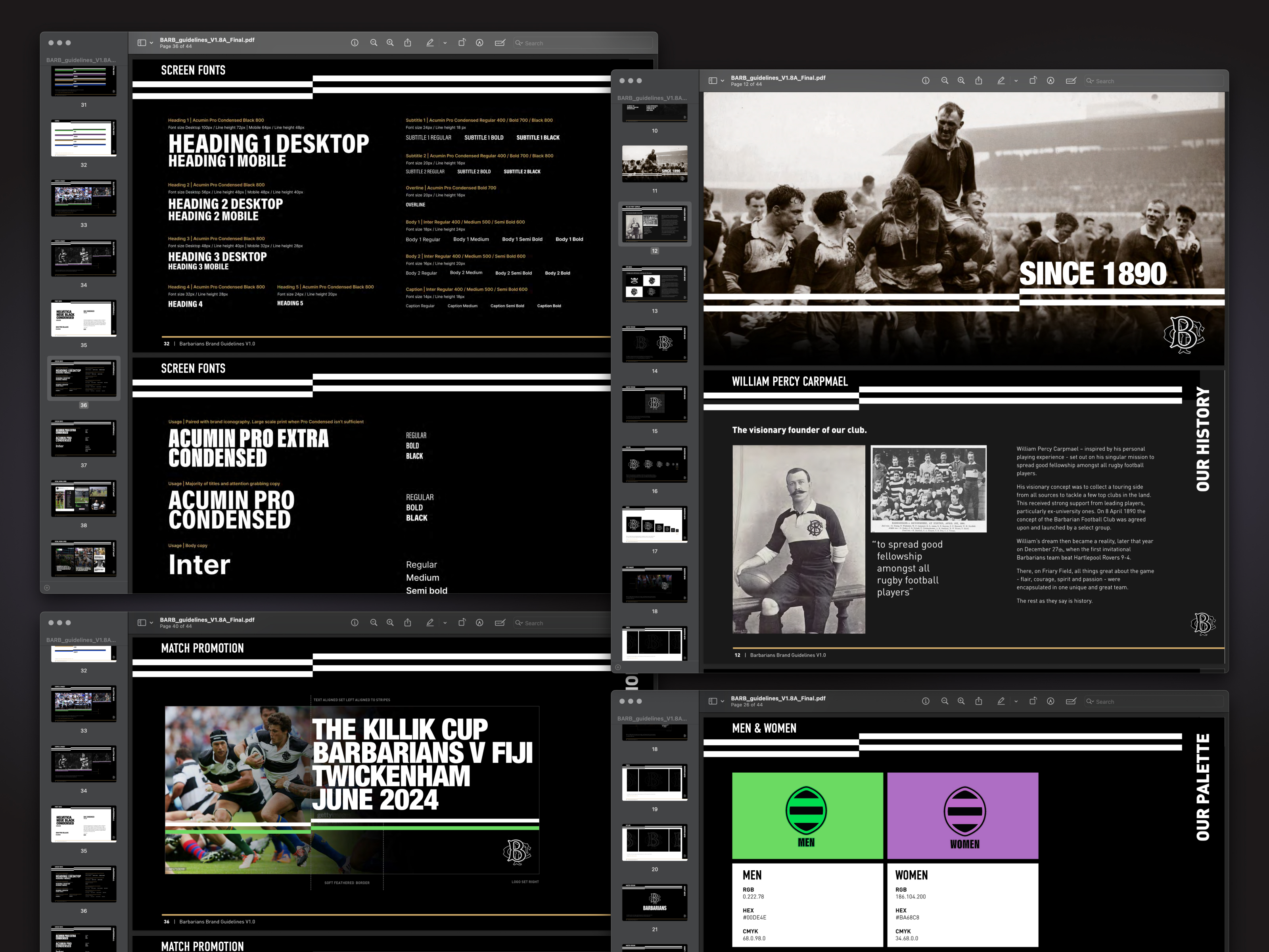
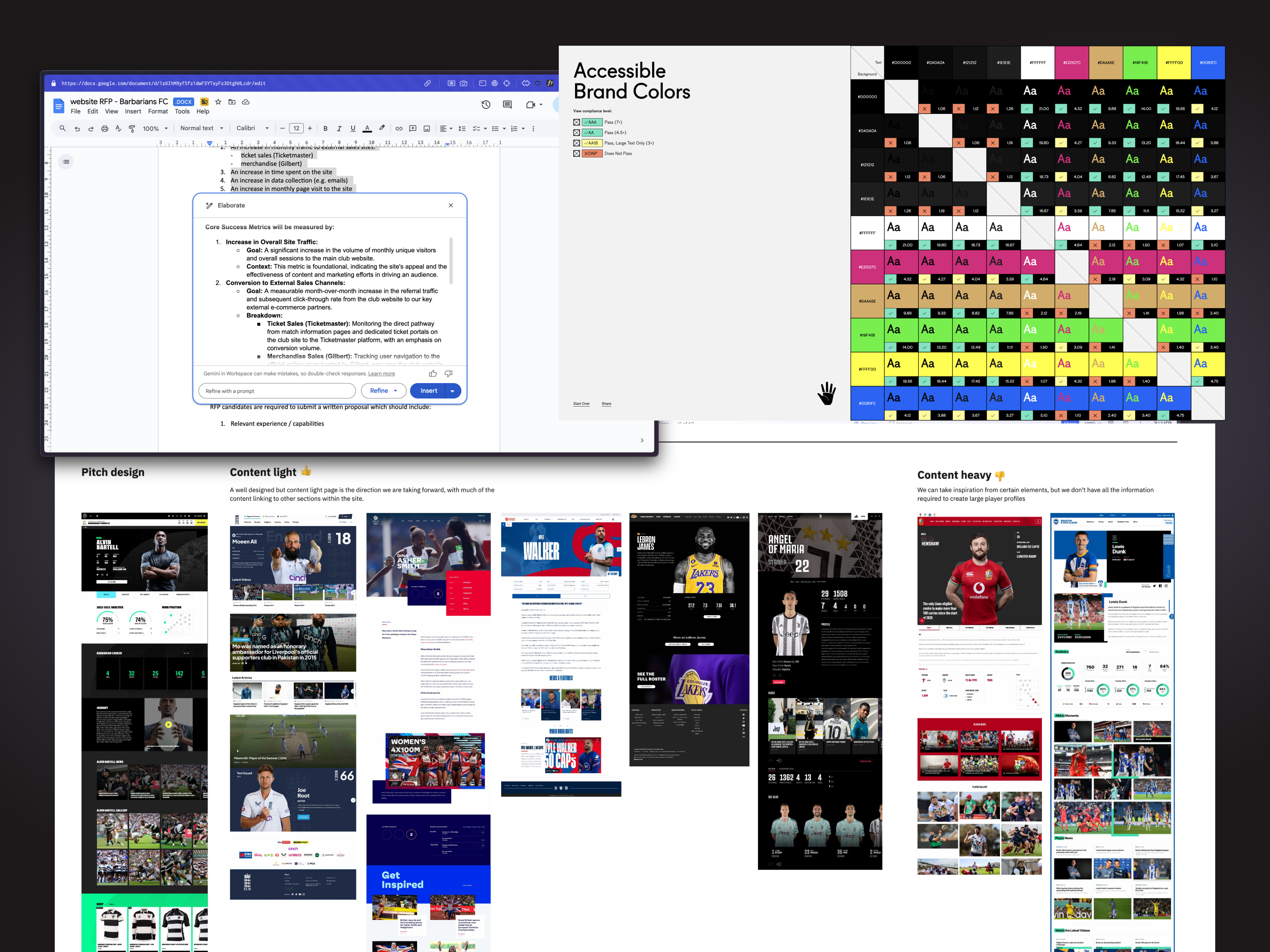
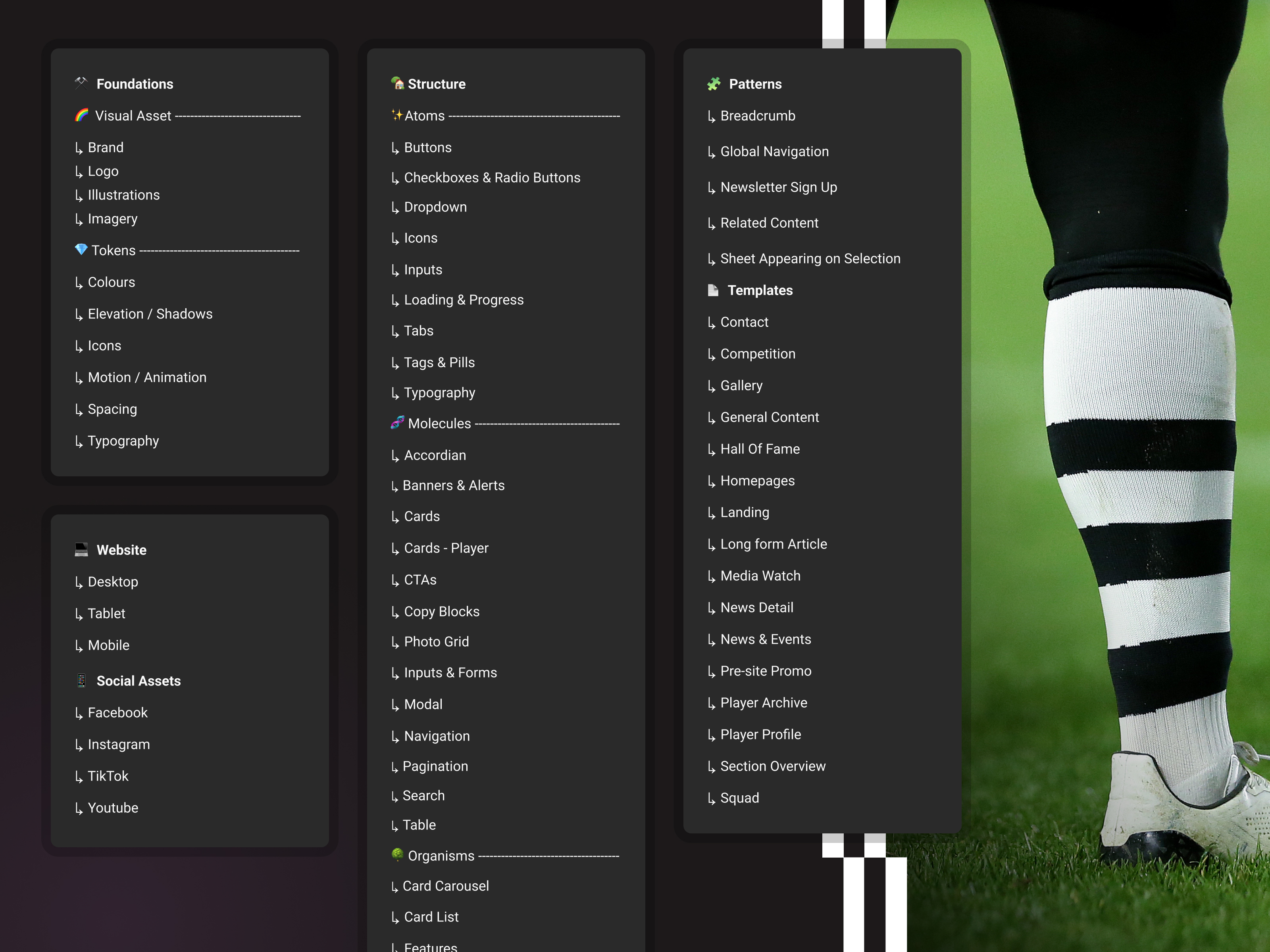
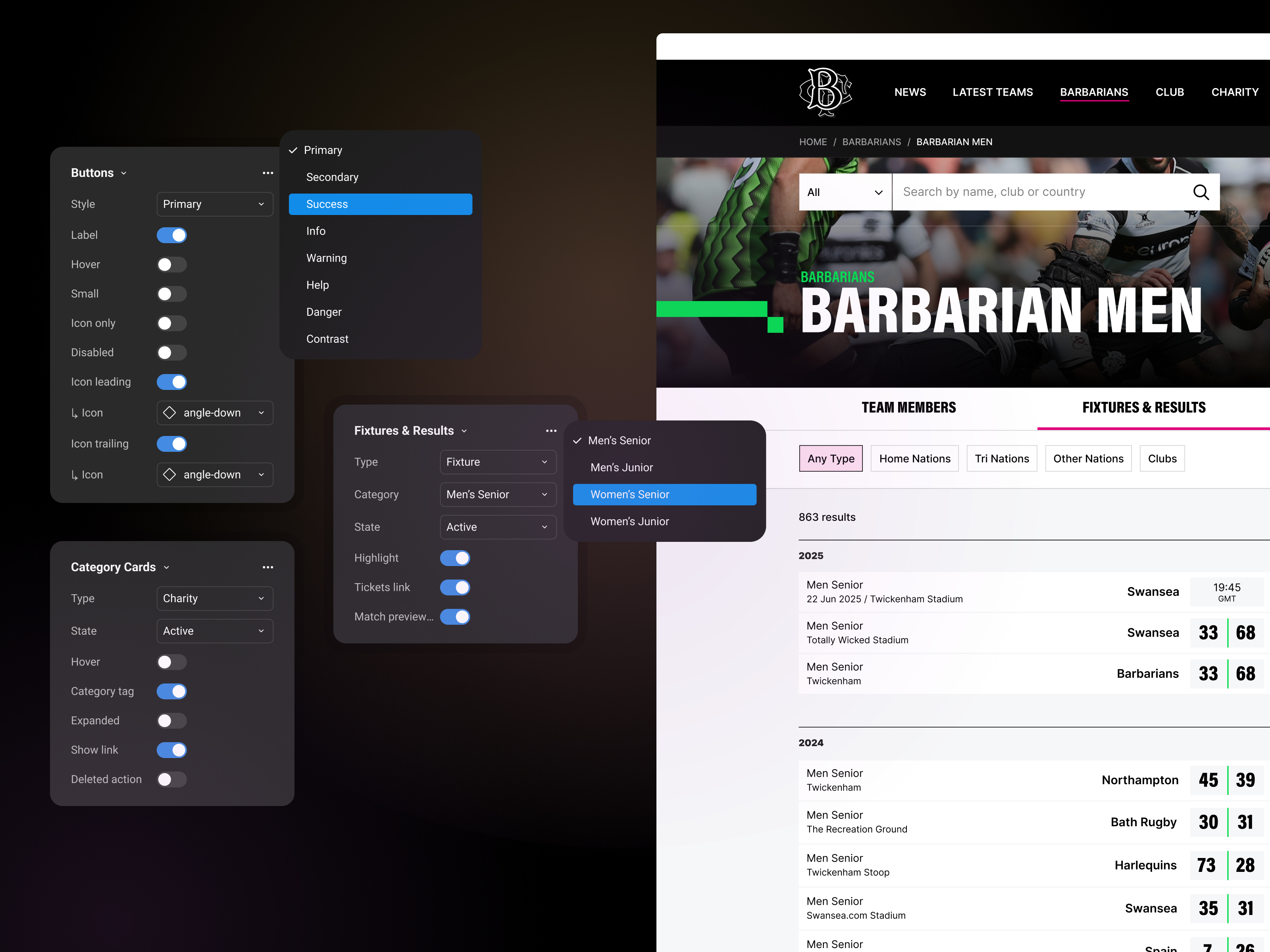
Design System Implementation: I created a Design System within Figma to maintain consistency and provide a single source of truth for the new digital brand. This system ensured all visual elements, components, and design patterns were immediately scalable and consistently applied across the website and future digital touch points.
A. Core Strategy & Information Architecture
Brand Strategy & Modernisation: Developed a digital-first brand strategy emphasising the nickname "BaaBaas" for social media traffic, ensuring brand effectiveness at small scales. This included creating the club's first-ever comprehensive brand guidelines, incorporating the world-famous shirt lines as a graphic motif across the digital platform.
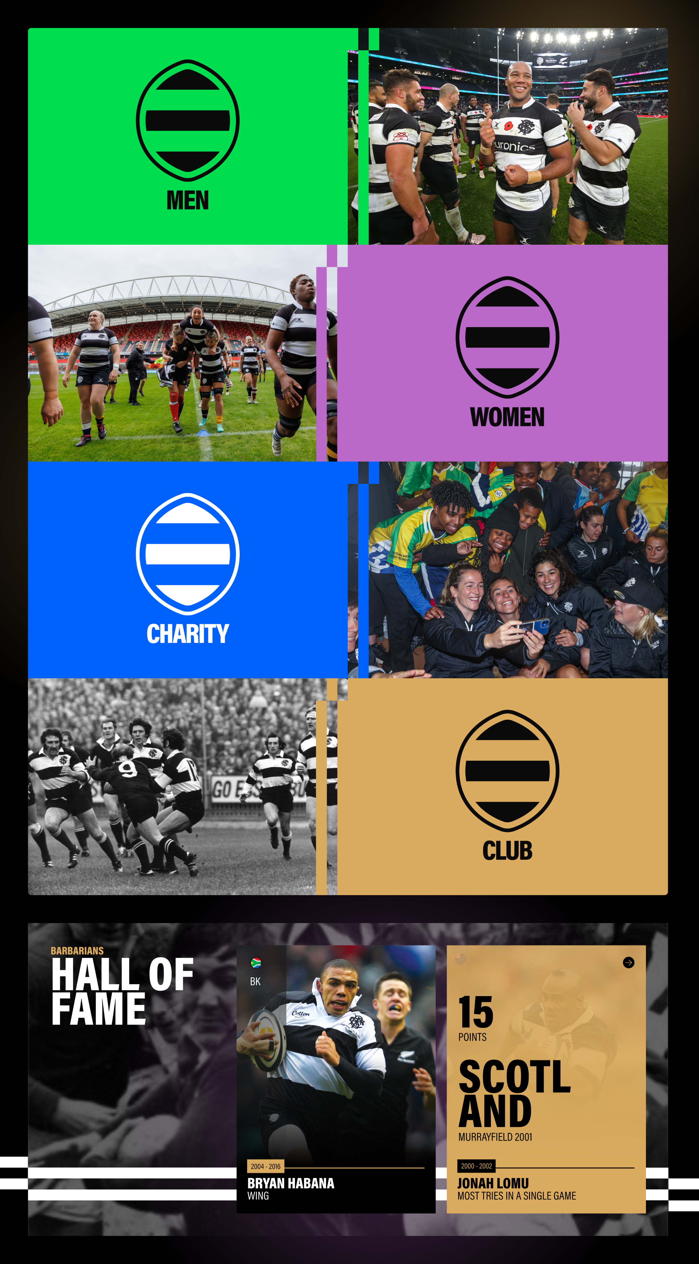
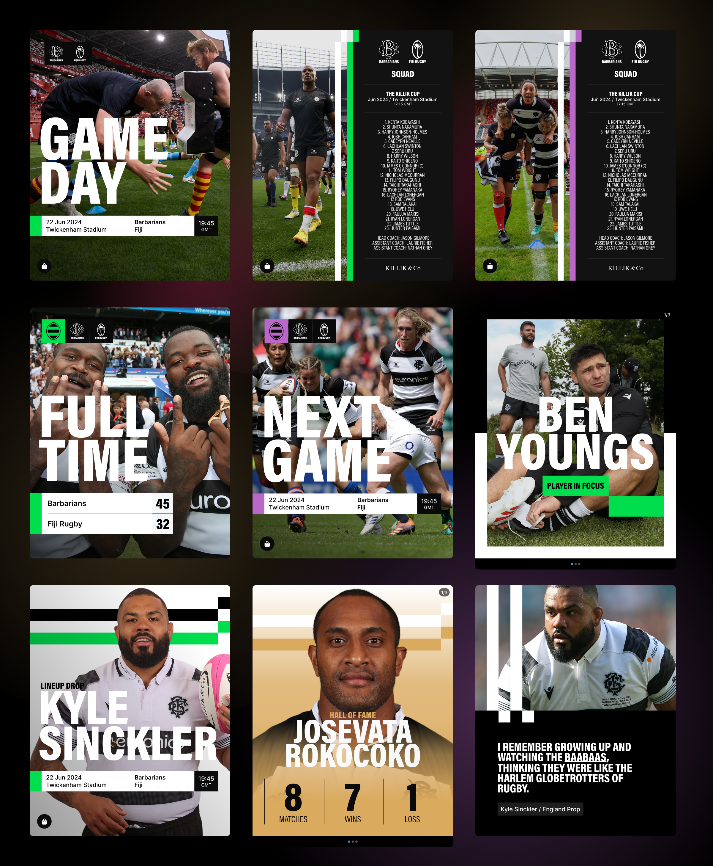
Visual System Segmentation: Designed and produced a custom, simplified icon set that visually tags content across segmented areas (Men's, Women's, Charity, etc.). This system ensures immediate recognition and brand consistency across high-volume assets like game cards, social posts, and news updates.
Digital Identity Collaboration: Worked with the external branding agency to ensure continuity, specifically collaborating on the development of a simplified, digital-only logo derived from the main club badge for high-volume, small-scale usage.
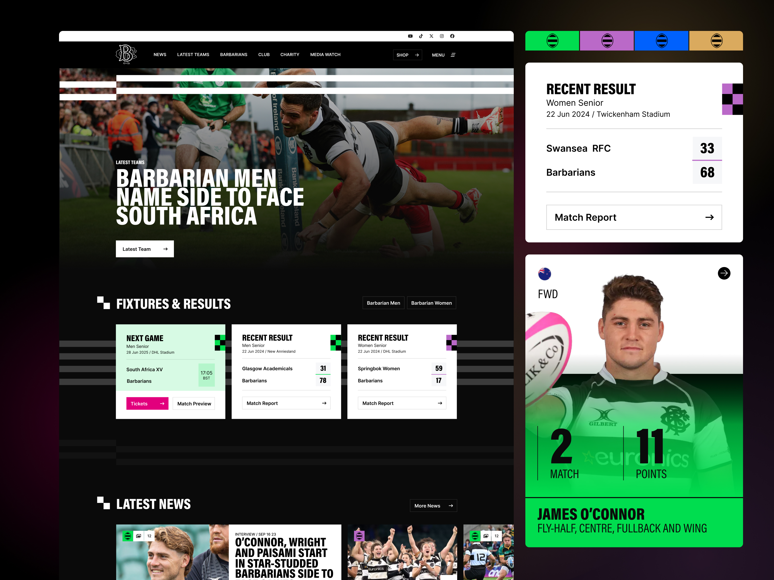
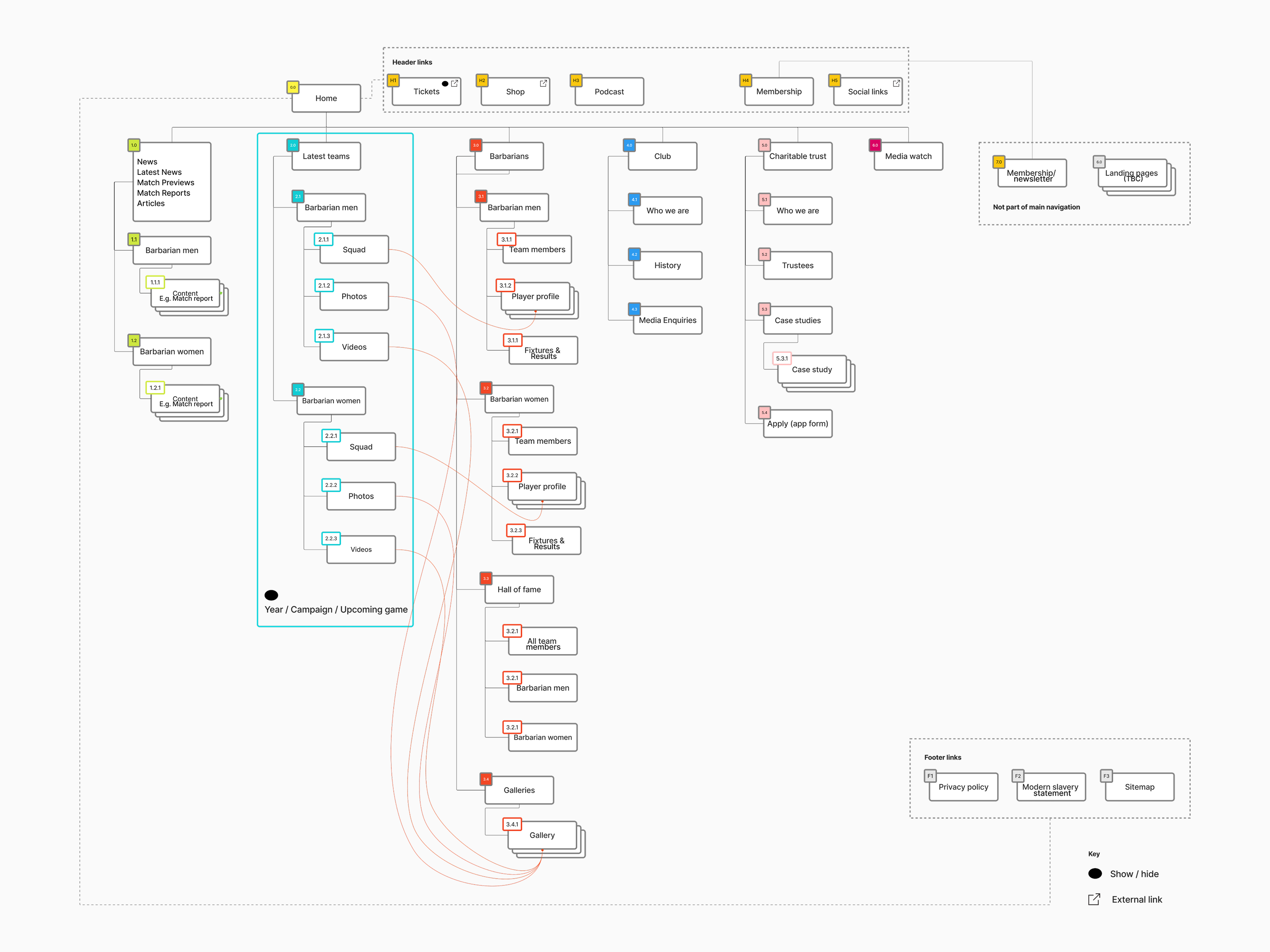
Information Architecture: Reworked the entire site architecture for cleaner navigation. Implemented a colour-coded system (Men's, Women's, Charity, Club) to visually prioritise content, reflecting an inclusive identity and improving content discoverability.
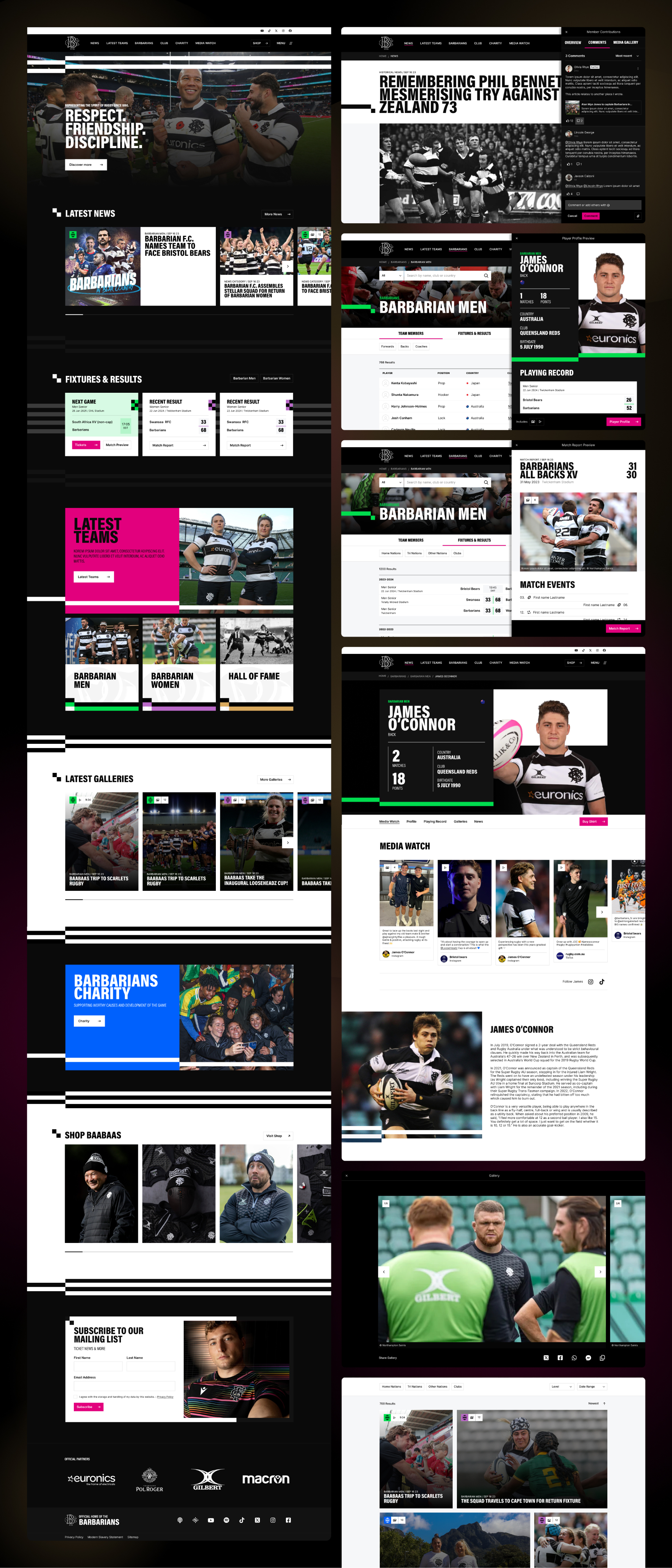
Content Strategy: Created dedicated templates for long-read articles and established the architecture for a future feature allowing users to add their own memories and contributions, planning for future community-driven content growth.
B. UX/UI Components (Conversion & Engagement)
We designed and developed a suite of modular components to directly address sales and community building:
Key Features & Design Function
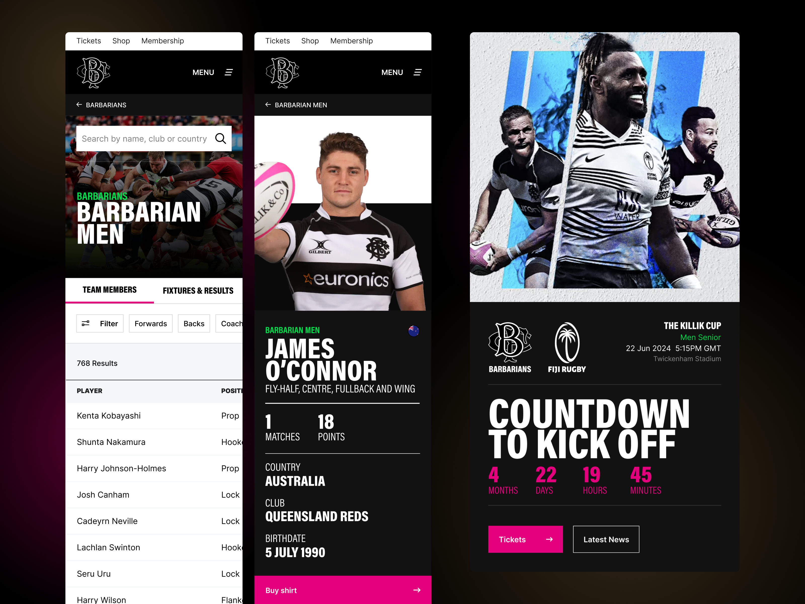
Conversion: Integrated dynamic sales banners (ensuring the CTA is the most visible element during sales periods) and a Merchandise Listing Component to seamlessly pull external store listings, reducing purchase friction.
Audience Building: Created a highly visible, strategically placed Newsletter Sign-up Module to convert passive visitors into measurable CRM leads.
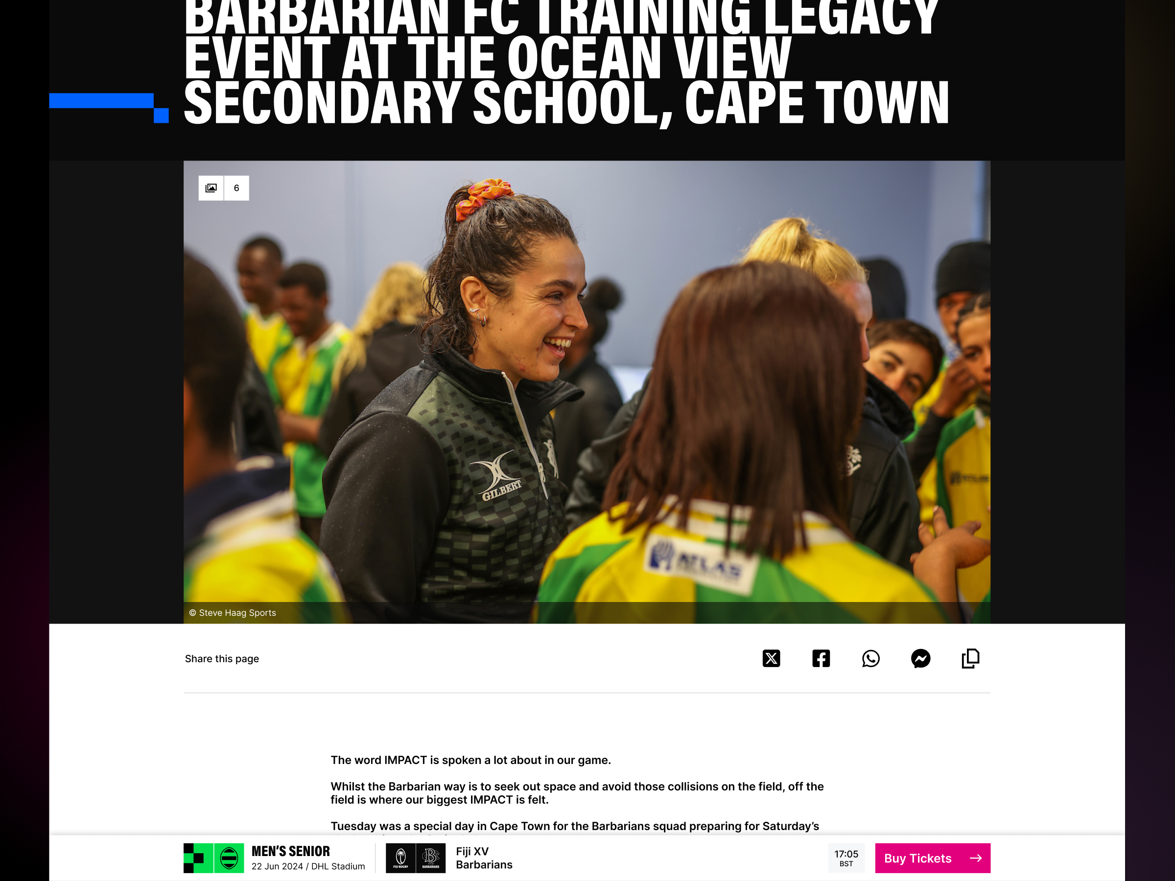
Content & Engagement: Embedded social media components (TikTok, YouTube, Instagram) to showcase real-time content. Created dedicated News and Gallery sections.
Data Discovery: Upgraded Player and Match Archives (including women's and legends sections) to enhance data accessibility. These archives are strategically linked through to individual player profiles and match reports, helping to keep users engaged in a deep-dive content flow and maximising historical content value.
4. Measurable Impact & Results
The design strategies directly addressed the commercial objectives, delivering significant, quantifiable growth.
Direct Resulting Impact
A 20% Increase in Ticket & Merchandise Sales: Simplified the navigation path to "Tickets" and "Shop" via streamlined architecture and high-visibility banners. The Merchandise Component reduced the cognitive load of navigating externally, driving impulse purchases.
A 30% Increase in Engagement (Stickiness): Enhanced Player Archive and Colour-Coded Content provided high-value content and allowed users to quickly filter and consume content relevant to their interests, encouraging longer session times.
Summary
The transformation delivered clear commercial value, validating the strategy that modern, goal-driven UX is a direct driver of revenue and audience growth.
Created at Totally.tech
Next project
GamCare / MyGamCare
Empowering control with MyGamCare portal
20,711 Goals set up and tracked within the first year of launch


Mockneybynature.design
Home
Barbarian FC
Digital transformation for a sports leader
I delivered a complete digital rebrand and website overhaul for Barbarian F.C., focusing on modernising their iconic brand identity while enhancing global user engagement.
Digital Branding
Creative & Product Strategy
User Research
Prototyping
Design System
Web Accessibility
B2C Acumen
30% Increase in stickiness

Slide 1
Slide 2
Slide 3
Slide 1
Slide 2
1. Challenge & Strategic Alignment
The primary goal was to modernise the club's digital presence to better reflect its inclusive identity and drive revenue in key areas where the previous site was underperforming.
Goals
Business Goals: Increase ticket and merchandise sales, boost overall brand engagement (stickiness), and establish a more professional and inclusive brand identity.
Strategic Kickoff: Drove the design process from initial workshops with directors and key figures (including Tim Percival and Rory Lawson) to ensure design decisions were rooted in measurable commercial outcomes.
2. Process, Team, and Design Phase
The project involved a lean, highly focused team operating under tight constraints, which required agile decision-making and creative solutions for testing.
Roles
Myself (Design Lead) and end-to-end designer: Driving strategy, UX/UI, and brand application.
Team Members: Frontend Developer (WordPress specialist), Project Manager and our Commercial Director.
Design phase and testing strategy
Design Phase: Lasted two months and utilised focused design sprints. The process included regularly presenting design rationale directly to the club directors for immediate feedback and sign-off.
Testing Strategy: Due to budget constraints, we implemented a lean but highly targeted testing strategy: internal QA combined with a small focus group comprising one of the director's children and their friends. This proved effective as the club's strategic objective was to attract and engage a younger audience making the feedback highly relevant and authentic.
3. Execution & Goal-Driven Design
The execution involved creating a scalable, content-rich platform through strategic design decisions across brand, structure, and component design.
Foundational Systems
Design System Implementation: I created a Design System within Figma to maintain consistency and provide a single source of truth for the new digital brand. This system ensured all visual elements, components, and design patterns were immediately scalable and consistently applied across the website and future digital touch points.
A. Core Strategy & Information Architecture
Brand Strategy & Modernisation: Developed a digital-first brand strategy emphasising the nickname "BaaBaas" for social media traffic, ensuring brand effectiveness at small scales. This included creating the club's first-ever comprehensive brand guidelines, incorporating the world-famous shirt lines as a graphic motif across the digital platform.
Visual System Segmentation: Designed and produced a custom, simplified icon set that visually tags content across segmented areas (Men's, Women's, Charity, etc.). This system ensures immediate recognition and brand consistency across high-volume assets like game cards, social posts, and news updates.
Digital Identity Collaboration: Worked with the external branding agency to ensure continuity, specifically collaborating on the development of a simplified, digital-only logo derived from the main club badge for high-volume, small-scale usage.
Information Architecture: Reworked the entire site architecture for cleaner navigation. Implemented a colour-coded system (Men's, Women's, Charity, Club) to visually prioritise content, reflecting an inclusive identity and improving content discoverability.
Content Strategy: Created dedicated templates for long-read articles and established the architecture for a future feature allowing users to add their own memories and contributions, planning for future community-driven content growth.
B. UX/UI Components (Conversion & Engagement)
We designed and developed a suite of modular components to directly address sales and community building:
Key Features & Design Function
Conversion: Integrated dynamic sales banners (ensuring the CTA is the most visible element during sales periods) and a Merchandise Listing Component to seamlessly pull external store listings, reducing purchase friction.
Audience Building: Created a highly visible, strategically placed Newsletter Sign-up Module to convert passive visitors into measurable CRM leads.
Content & Engagement: Embedded social media components (TikTok, YouTube, Instagram) to showcase real-time content. Created dedicated News and Gallery sections.
Data Discovery: Upgraded Player and Match Archives (including women's and legends sections) to enhance data accessibility. These archives are strategically linked through to individual player profiles and match reports, helping to keep users engaged in a deep-dive content flow and maximising historical content value.
4. Measurable Impact & Results
The design strategies directly addressed the commercial objectives, delivering significant, quantifiable growth.
Direct Resulting Impact
A 20% Increase in Ticket & Merchandise Sales: Simplified the navigation path to "Tickets" and "Shop" via streamlined architecture and high-visibility banners. The Merchandise Component reduced the cognitive load of navigating externally, driving impulse purchases.
A 30% Increase in Engagement (Stickiness): Enhanced Player Archive and Colour-Coded Content provided high-value content and allowed users to quickly filter and consume content relevant to their interests, encouraging longer session times.
Summary
The transformation delivered clear commercial value, validating the strategy that modern, goal-driven UX is a direct driver of revenue and audience growth.
Created at Totally.tech
Next project
GamCare / MyGamCare
20,711 Goals set up and tracked within the first year of launch
Digital Branding
Creative & Product Strategy
User Research
Prototyping
Design System
Web Accessibility
B2C Acumen
Mockneybynature.design


Home
Barbarian FC
Digital transformation for a sports leader
I delivered a complete digital rebrand and website overhaul for Barbarian F.C., focusing on modernising their iconic brand identity while enhancing global user engagement.
Digital Branding
Creative & Product Strategy
User Research
Prototyping
Design System
Web Accessibility
B2C Acumen
30% Increase in stickiness

Slide 1
Slide 2
Slide 3
Slide 1
Slide 2
1. Challenge & Strategic Alignment
The primary goal was to modernise the club's digital presence to better reflect its inclusive identity and drive revenue in key areas where the previous site was underperforming.
Goals
Business Goals: Increase ticket and merchandise sales, boost overall brand engagement (stickiness), and establish a more professional and inclusive brand identity.
Strategic Kickoff: Drove the design process from initial workshops with directors and key figures (including Tim Percival and Rory Lawson) to ensure design decisions were rooted in measurable commercial outcomes.
2. Process, Team, and Design Phase
The project involved a lean, highly focused team operating under tight constraints, which required agile decision-making and creative solutions for testing.
Roles
Myself (Design Lead) and end-to-end designer: Driving strategy, UX/UI, and brand application.
Team Members: Frontend Developer (WordPress specialist), Project Manager and our Commercial Director.
Design phase and testing strategy
Design Phase: Lasted two months and utilised focused design sprints. The process included regularly presenting design rationale directly to the club directors for immediate feedback and sign-off.
Testing Strategy: Due to budget constraints, we implemented a lean but highly targeted testing strategy: internal QA combined with a small focus group comprising one of the director's children and their friends. This proved effective as the club's strategic objective was to attract and engage a younger audience making the feedback highly relevant and authentic.
3. Execution & Goal-Driven Design
The execution involved creating a scalable, content-rich platform through strategic design decisions across brand, structure, and component design.
Foundational Systems
Design System Implementation: I created a Design System within Figma to maintain consistency and provide a single source of truth for the new digital brand. This system ensured all visual elements, components, and design patterns were immediately scalable and consistently applied across the website and future digital touch points.
A. Core Strategy & Information Architecture
Brand Strategy & Modernisation: Developed a digital-first brand strategy emphasising the nickname "BaaBaas" for social media traffic, ensuring brand effectiveness at small scales. This included creating the club's first-ever comprehensive brand guidelines, incorporating the world-famous shirt lines as a graphic motif across the digital platform.
Visual System Segmentation: Designed and produced a custom, simplified icon set that visually tags content across segmented areas (Men's, Women's, Charity, etc.). This system ensures immediate recognition and brand consistency across high-volume assets like game cards, social posts, and news updates.
Digital Identity Collaboration: Worked with the external branding agency to ensure continuity, specifically collaborating on the development of a simplified, digital-only logo derived from the main club badge for high-volume, small-scale usage.
Information Architecture: Reworked the entire site architecture for cleaner navigation. Implemented a colour-coded system (Men's, Women's, Charity, Club) to visually prioritise content, reflecting an inclusive identity and improving content discoverability.
Content Strategy: Created dedicated templates for long-read articles and established the architecture for a future feature allowing users to add their own memories and contributions, planning for future community-driven content growth.
B. UX/UI Components (Conversion & Engagement)
We designed and developed a suite of modular components to directly address sales and community building:
Key Features & Design Function
Conversion: Integrated dynamic sales banners (ensuring the CTA is the most visible element during sales periods) and a Merchandise Listing Component to seamlessly pull external store listings, reducing purchase friction.
Audience Building: Created a highly visible, strategically placed Newsletter Sign-up Module to convert passive visitors into measurable CRM leads.
Content & Engagement: Embedded social media components (TikTok, YouTube, Instagram) to showcase real-time content. Created dedicated News and Gallery sections.
Data Discovery: Upgraded Player and Match Archives (including women's and legends sections) to enhance data accessibility. These archives are strategically linked through to individual player profiles and match reports, helping to keep users engaged in a deep-dive content flow and maximising historical content value.
4. Measurable Impact & Results
The design strategies directly addressed the commercial objectives, delivering significant, quantifiable growth.
Direct Resulting Impact
A 20% Increase in Ticket & Merchandise Sales: Simplified the navigation path to "Tickets" and "Shop" via streamlined architecture and high-visibility banners. The Merchandise Component reduced the cognitive load of navigating externally, driving impulse purchases.
A 30% Increase in Engagement (Stickiness): Enhanced Player Archive and Colour-Coded Content provided high-value content and allowed users to quickly filter and consume content relevant to their interests, encouraging longer session times.
Summary
The transformation delivered clear commercial value, validating the strategy that modern, goal-driven UX is a direct driver of revenue and audience growth.
Created at Totally.tech
Next project
GamCare / MyGamCare
Web design for one of the country's leading property portals
20,711 Goals set up and tracked within the first year of launch
Digital Branding
Creative & Product Strategy
User Research
Prototyping
Design System
Web Accessibility
B2C Acumen
Mockneybynature.design