

Home
Share to Buy
Digital transformation for one the UK’s leading property portals
I led end-to-end design for a major refresh of Share to Buy — the UK's leading affordable homeownership portal, serving over 120,000 monthly users. The scope covered digital brand, UX strategy, design system, and a ground-up rethink of the platform's core transactional flows.
Digital Branding
Creative & Product Strategy
User Research
Prototyping
Design System
Web Accessibility
B2C Acumen
20% lift in conversion rates

A UX problem with commercial consequences
Share to Buy needed to reduce friction across property search and applications while elevating the brand to feel more professional and inclusive. These weren't purely UX problems - they were directly tied to business targets: improving registrations, increasing enquiries, and boosting stickiness.
Business Goals
Boost brand engagement, improve registrations and property enquiries, establish a more professional and inclusive identity.
Strategic Input
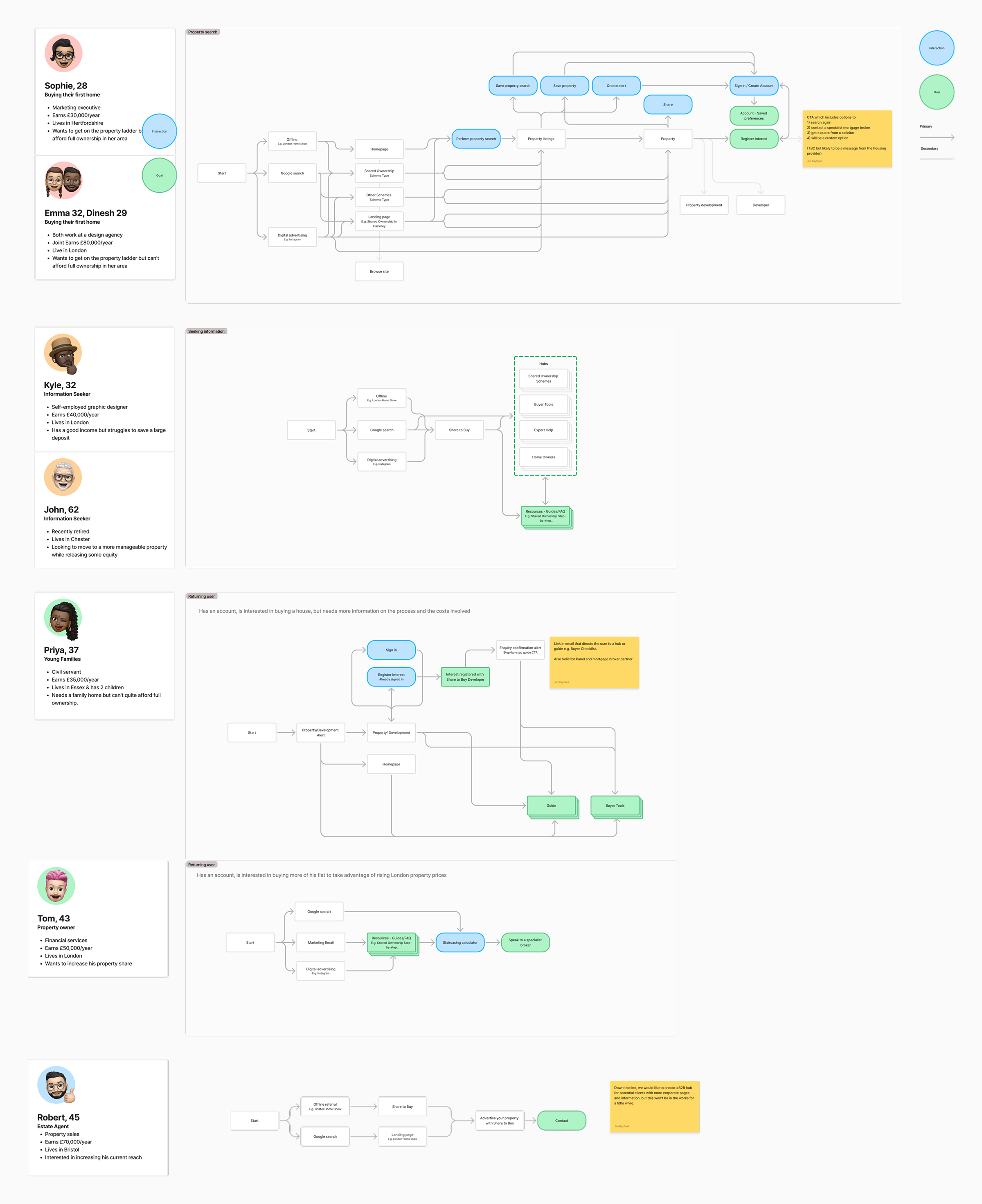
Joined the project early, working with directors and stakeholders to frame the brief around measurable outcomes. Workshops surfaced the transactional layer as the highest-impact opportunity.
Lean team, mobile-first from day one
Three months of focused sprints with a lean team: UX designer, frontend developer, PM, and commercial director. With 80% of traffic from mobile, every decision was shaped by a mobile-first lens.
My Role
Led design strategy and execution end-to-end - UX/UI, brand application, and a scalable Figma design system. Collaborated with the UX designer on research and early structural work, then owned visual direction and component design.
Testing
Internal QA plus a small focus group of current and past users, validating the new design against their reported pain points from the previous site.
What we built
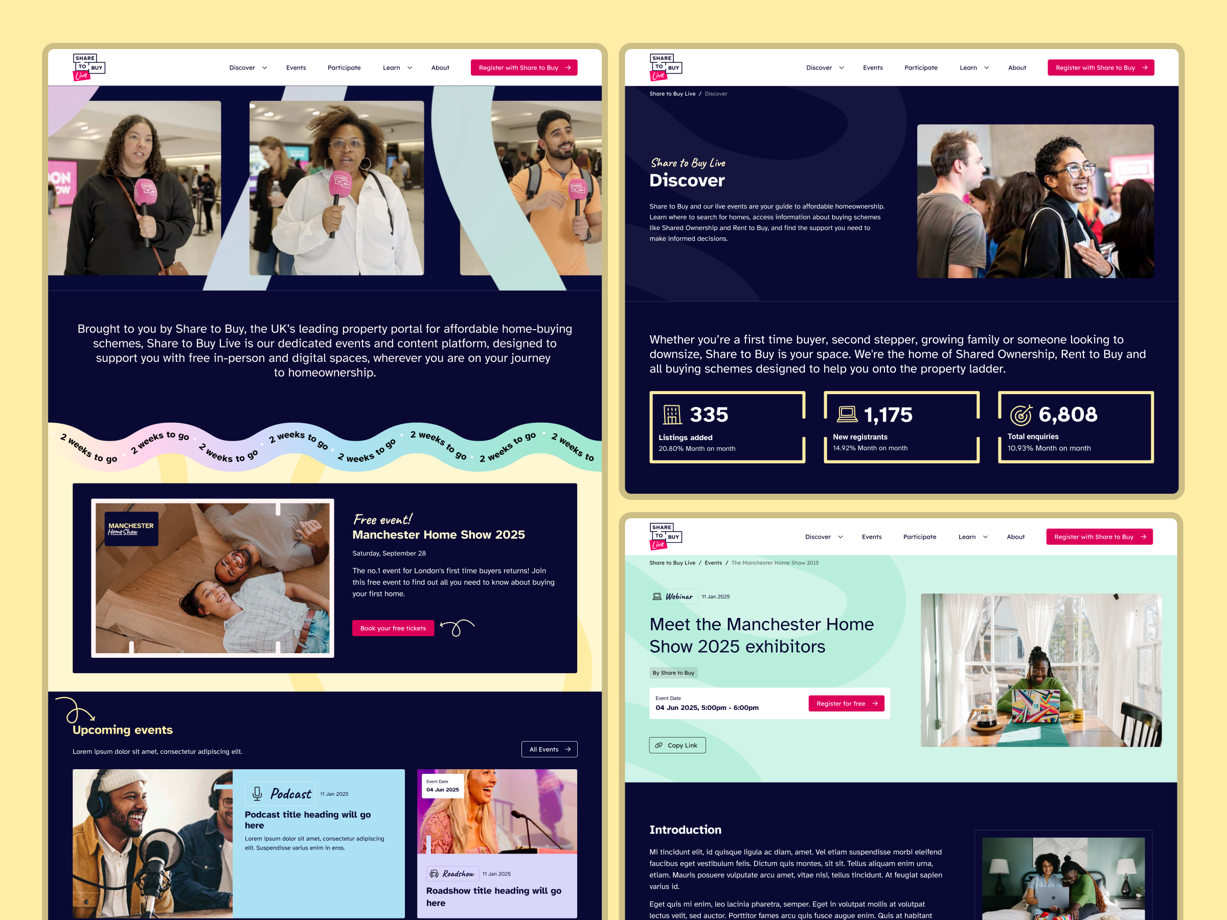
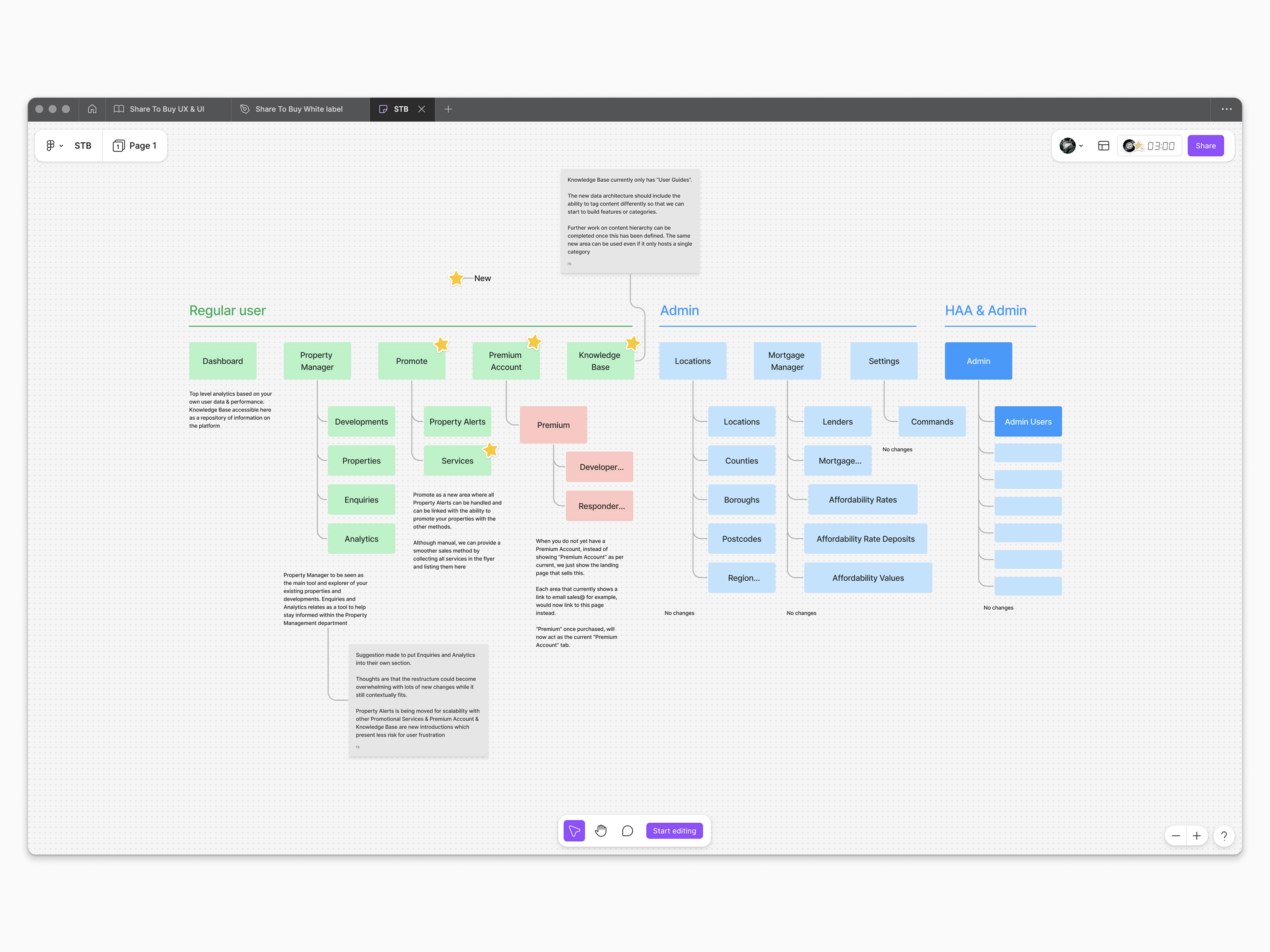
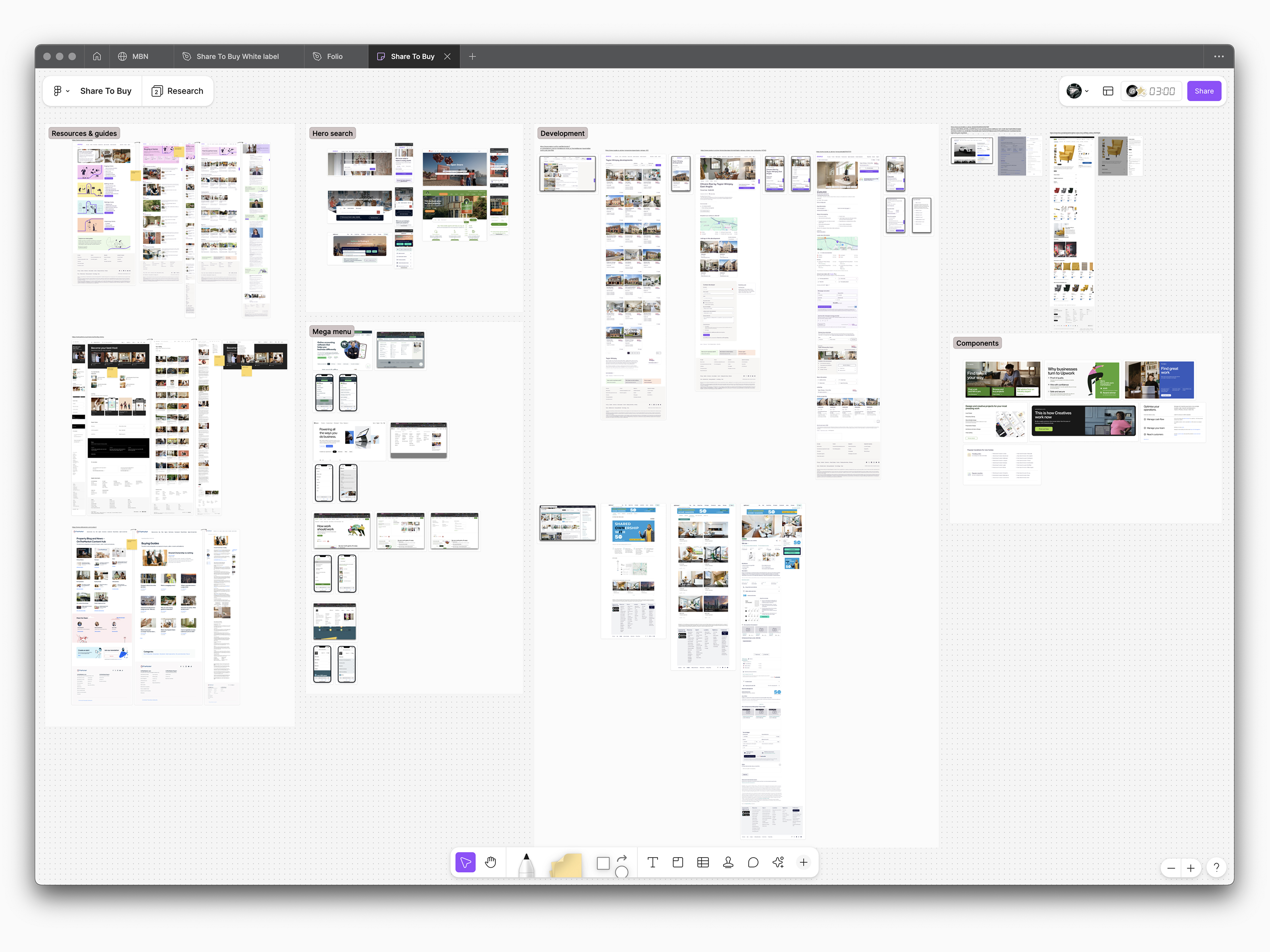
Built a design system in Figma as a single source of truth for the digital brand, scalable enough to extend to a yearly property event microsite and a white-label build for the london.gov.uk shared homes initiative.
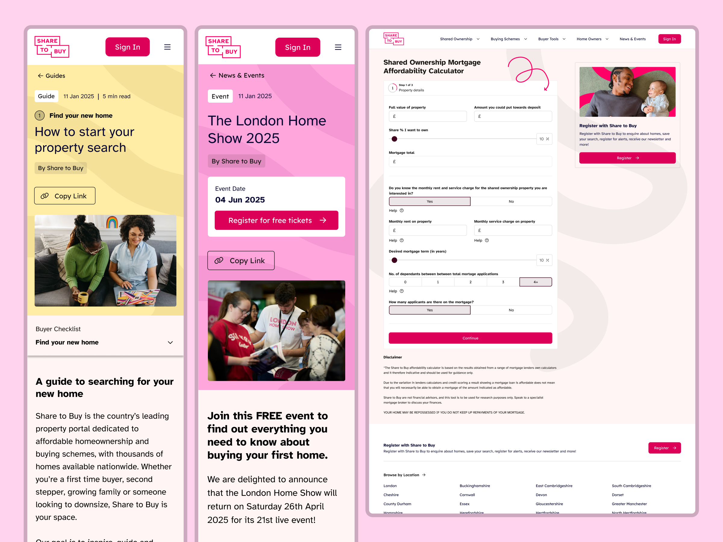
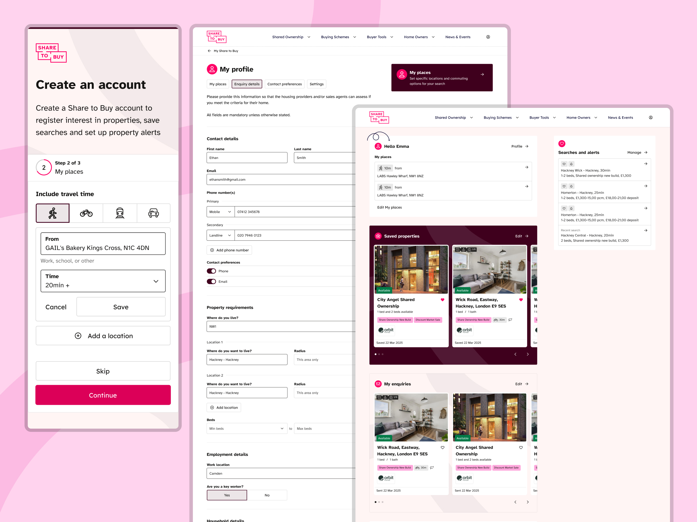
User Portal
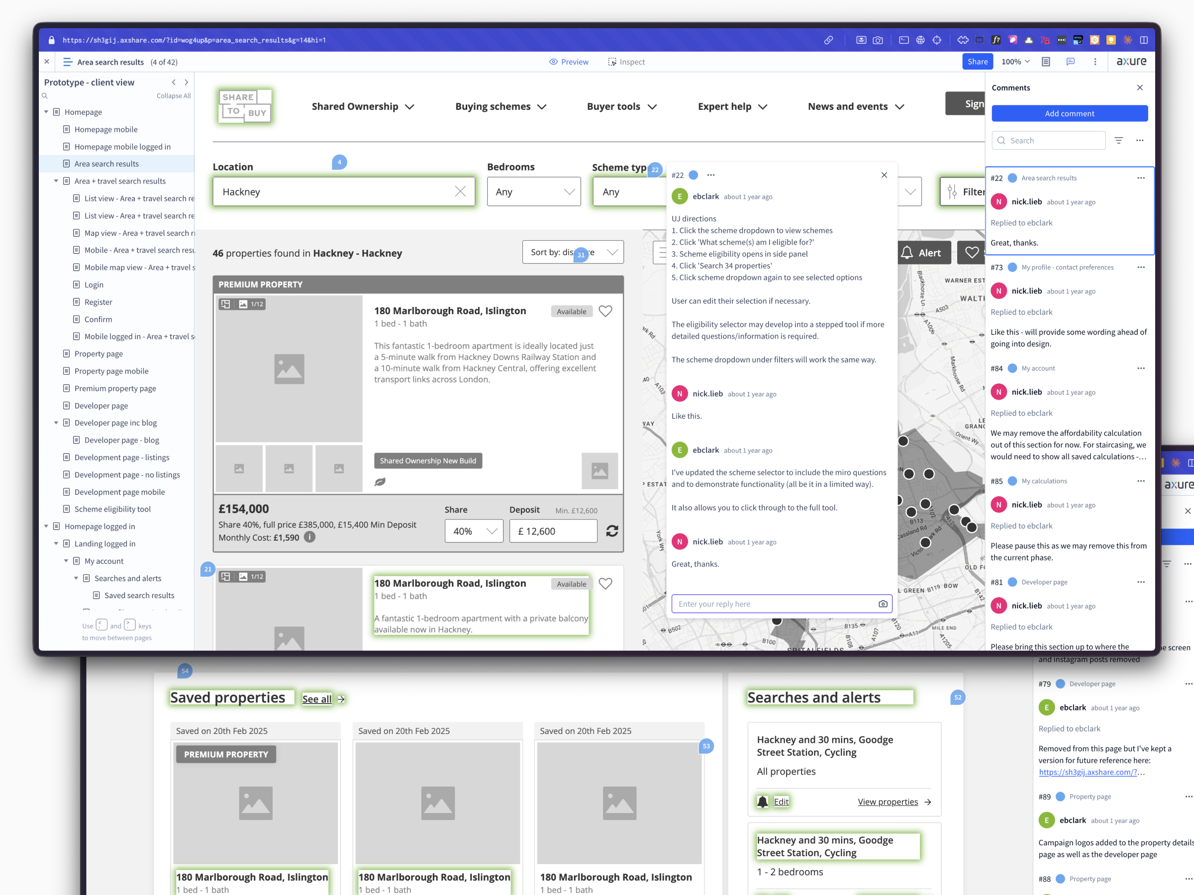
Rebuilt from scratch, enabling auto-fill across large credential forms and cutting drop-off in the application process.
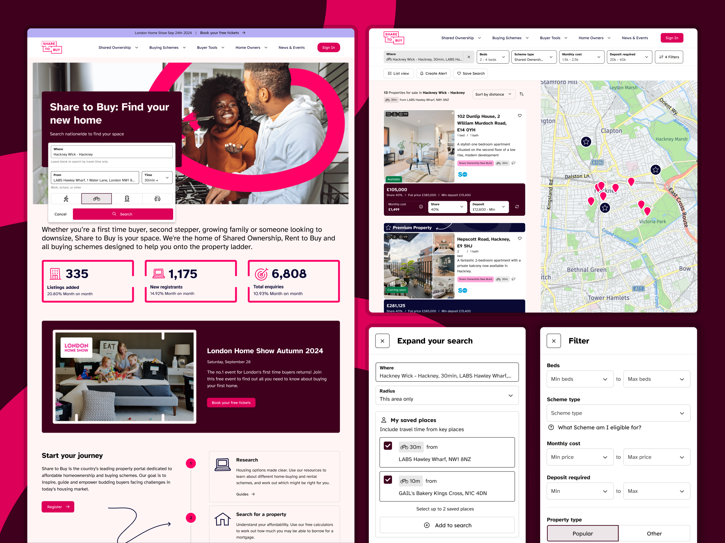
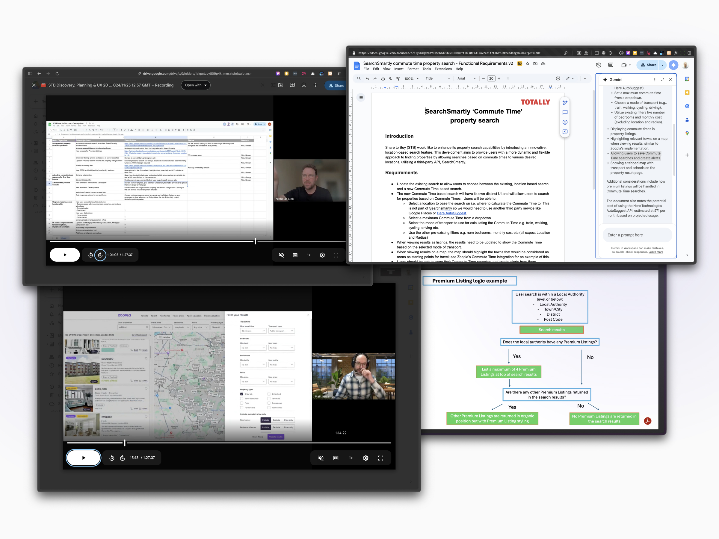
Property search
Integrated SearchSmartly so users could find properties by travel time from saved locations, paired with a stronger map view.
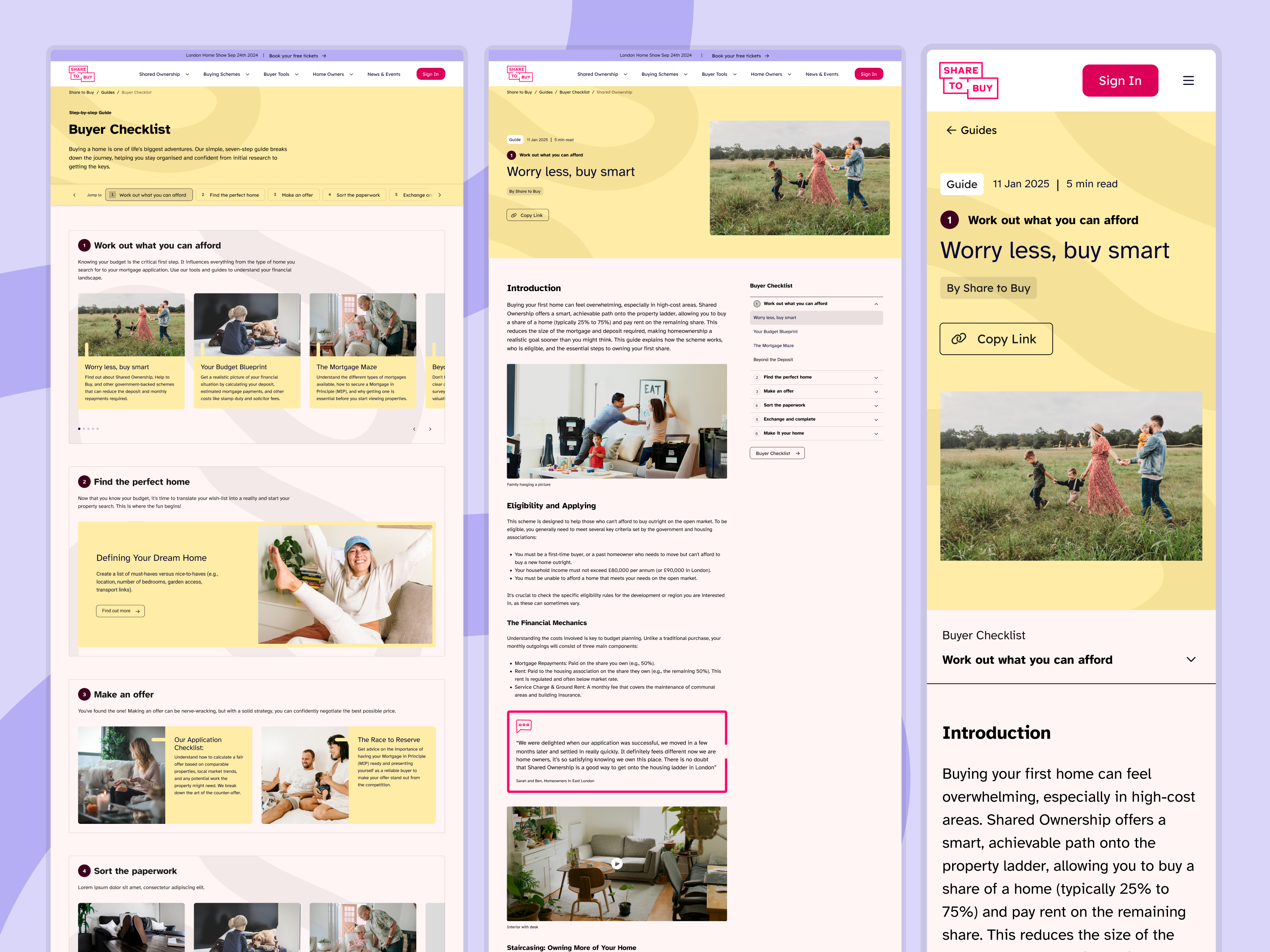
Information architecture
Restructured site architecture with multistep guides and new landing page templates to improve depth and support marketing goals.
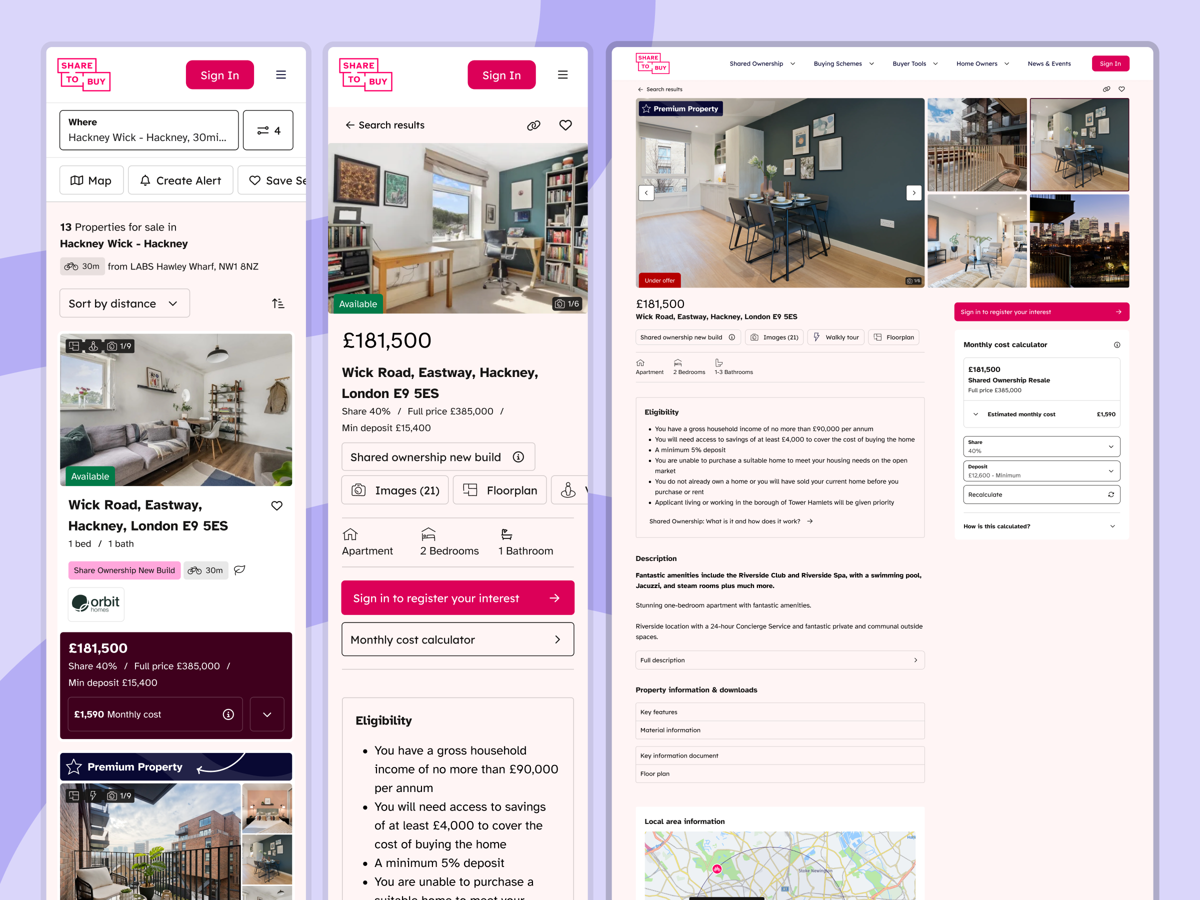
Mobile UX
Kept property detail pages lean, surfacing additional detail through sheet/tray interactions on demand.
Results
20% Lift in conversion rates
The User Portal's auto-fill capability was the headline driver, removing the biggest barrier for high-intent users moving through the application funnel.
Engagement and search improved across the board, validating the core strategy: treat UX friction as a commercial problem.
Connecting every design decision to a business outcome from day one is what drove the 20% conversion lift. The strategy was never about cosmetics.
Created at Totally.tech
Slide 1
Slide 2
Slide 3
Slide 4
Next project
Barbarian FC
Digital transformation for a sports leader
30% Increase in stickiness


Mockneybynature.design
Home
Share to Buy
Digital transformation for one the UK’s leading property portals
I led end-to-end design for a major refresh of Share to Buy — the UK's leading affordable homeownership portal, serving over 120,000 monthly users. The scope covered digital brand, UX strategy, design system, and a ground-up rethink of the platform's core transactional flows.
Digital Branding
Creative & Product Strategy
User Research
Prototyping
Design System
Web Accessibility
B2C Acumen
20% lift in conversion rates

A UX problem with commercial consequences
Share to Buy needed to reduce friction across property search and applications while elevating the brand to feel more professional and inclusive. These weren't purely UX problems - they were directly tied to business targets: improving registrations, increasing enquiries, and boosting stickiness.
Business Goals
Boost brand engagement, improve registrations and property enquiries, establish a more professional and inclusive identity.
Strategic Input
Joined the project early, working with directors and stakeholders to frame the brief around measurable outcomes. Workshops surfaced the transactional layer as the highest-impact opportunity.
Lean team, mobile-first from day one
Three months of focused sprints with a lean team: UX designer, frontend developer, PM, and commercial director. With 80% of traffic from mobile, every decision was shaped by a mobile-first lens.
My Role
Led design strategy and execution end-to-end - UX/UI, brand application, and a scalable Figma design system. Collaborated with the UX designer on research and early structural work, then owned visual direction and component design.
Testing
Internal QA plus a small focus group of current and past users, validating the new design against their reported pain points from the previous site.
What we built
Built a design system in Figma as a single source of truth for the digital brand, scalable enough to extend to a yearly property event microsite and a white-label build for the london.gov.uk shared homes initiative.
User Portal
Rebuilt from scratch, enabling auto-fill across large credential forms and cutting drop-off in the application process.
Property search
Integrated SearchSmartly so users could find properties by travel time from saved locations, paired with a stronger map view.
Information architecture
Restructured site architecture with multistep guides and new landing page templates to improve depth and support marketing goals.
Mobile UX
Kept property detail pages lean, surfacing additional detail through sheet/tray interactions on demand.
Results
20% Lift in conversion rates
The User Portal's auto-fill capability was the headline driver, removing the biggest barrier for high-intent users moving through the application funnel.
Engagement and search improved across the board, validating the core strategy: treat UX friction as a commercial problem.
Connecting every design decision to a business outcome from day one is what drove the 20% conversion lift. The strategy was never about cosmetics.
Created at Totally.tech
Slide 1
Slide 2
Slide 3
Slide 4
Next project
Barbarian FC
30% Increase in stickiness
Digital Branding
Creative & Product Strategy
User Research
Prototyping
Design System
Web Accessibility
B2C Acumen
Mockneybynature.design


Home
Share to Buy
Digital transformation for one the UK’s leading property portals
I led end-to-end design for a major refresh of Share to Buy — the UK's leading affordable homeownership portal, serving over 120,000 monthly users. The scope covered digital brand, UX strategy, design system, and a ground-up rethink of the platform's core transactional flows.
Digital Branding
Creative & Product Strategy
User Research
Prototyping
Design System
Web Accessibility
B2C Acumen
20% lift in conversion rates

A UX problem with commercial consequences
Share to Buy needed to reduce friction across property search and applications while elevating the brand to feel more professional and inclusive. These weren't purely UX problems - they were directly tied to business targets: improving registrations, increasing enquiries, and boosting stickiness.
Business Goals
Boost brand engagement, improve registrations and property enquiries, establish a more professional and inclusive identity.
Strategic Input
Joined the project early, working with directors and stakeholders to frame the brief around measurable outcomes. Workshops surfaced the transactional layer as the highest-impact opportunity.
Lean team, mobile-first from day one
Three months of focused sprints with a lean team: UX designer, frontend developer, PM, and commercial director. With 80% of traffic from mobile, every decision was shaped by a mobile-first lens.
My Role
Led design strategy and execution end-to-end - UX/UI, brand application, and a scalable Figma design system. Collaborated with the UX designer on research and early structural work, then owned visual direction and component design.
Testing
Internal QA plus a small focus group of current and past users, validating the new design against their reported pain points from the previous site.
What we built
Built a design system in Figma as a single source of truth for the digital brand, scalable enough to extend to a yearly property event microsite and a white-label build for the london.gov.uk shared homes initiative.
User Portal
Rebuilt from scratch, enabling auto-fill across large credential forms and cutting drop-off in the application process.
Property search
Integrated SearchSmartly so users could find properties by travel time from saved locations, paired with a stronger map view.
Information architecture
Restructured site architecture with multistep guides and new landing page templates to improve depth and support marketing goals.
Mobile UX
Kept property detail pages lean, surfacing additional detail through sheet/tray interactions on demand.
Slide 1
Slide 2
Slide 3
Slide 4
Results
20% Lift in conversion rates
The User Portal's auto-fill capability was the headline driver, removing the biggest barrier for high-intent users moving through the application funnel.
Engagement and search improved across the board, validating the core strategy: treat UX friction as a commercial problem.
Connecting every design decision to a business outcome from day one is what drove the 20% conversion lift. The strategy was never about cosmetics.
Created at Totally.tech
Next project
Barbarian FC
Web design for one of the country's leading property portals
30% Increase in stickiness
Digital Branding
Creative & Product Strategy
User Research
Prototyping
Design System
Web Accessibility
B2C Acumen
Mockneybynature.design